GOBikeT/O
GOBikeT/O
An app aimed at helping cyclists in Toronto feel genuinely confident to ride in the city.
GOBikeT/O is an app concept resulting from an upper level design research course at OCAD University. Intended for cyclists who are new to and uncomfortable with Toronto’s cycling infrastructure, it encourages safer, informed route planning for cyclists and rewards users for safe habits. Cyclists who use the app can also use a small handlebar-mounted screen that communicates directions and warns of hazards. The problem space, research questions and concept evolved throughout the course of the project as my teammates and I enacted a design research process.
Problem Definition
How might we empower cyclists new to Toronto to have genuine confidence while riding in the city?
Methods
Secondary qualitative and quantitative research
Primary qualitative user research
AEIOU (activities, environments, interactions, objects, users) observational framework
Autoethnography reporting
Semi-structured user interviews
Data analysis & synthesis
Low-fidelity physical and digital prototyping
Usability testing
Key Insights
Research supports observations that Toronto has poor cycling infrastructure / support systems for cyclists new to the city.
Interviewees believed that a major issue is a lack of education on safe cycling practices in Toronto.
Many cyclists view their peers as dangerous and untrustworthy, comparably so to drivers.
Solutions to this problem must give individual cyclists a degree of control over their environment – fixing the city’s infrastructure is not practical within the project’s scope.
Solutions must not cause overconfidence in relation to one’s cycling capabilities or experience, hence the distinction of “genuine confidence”.
Solution Development
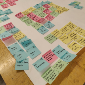
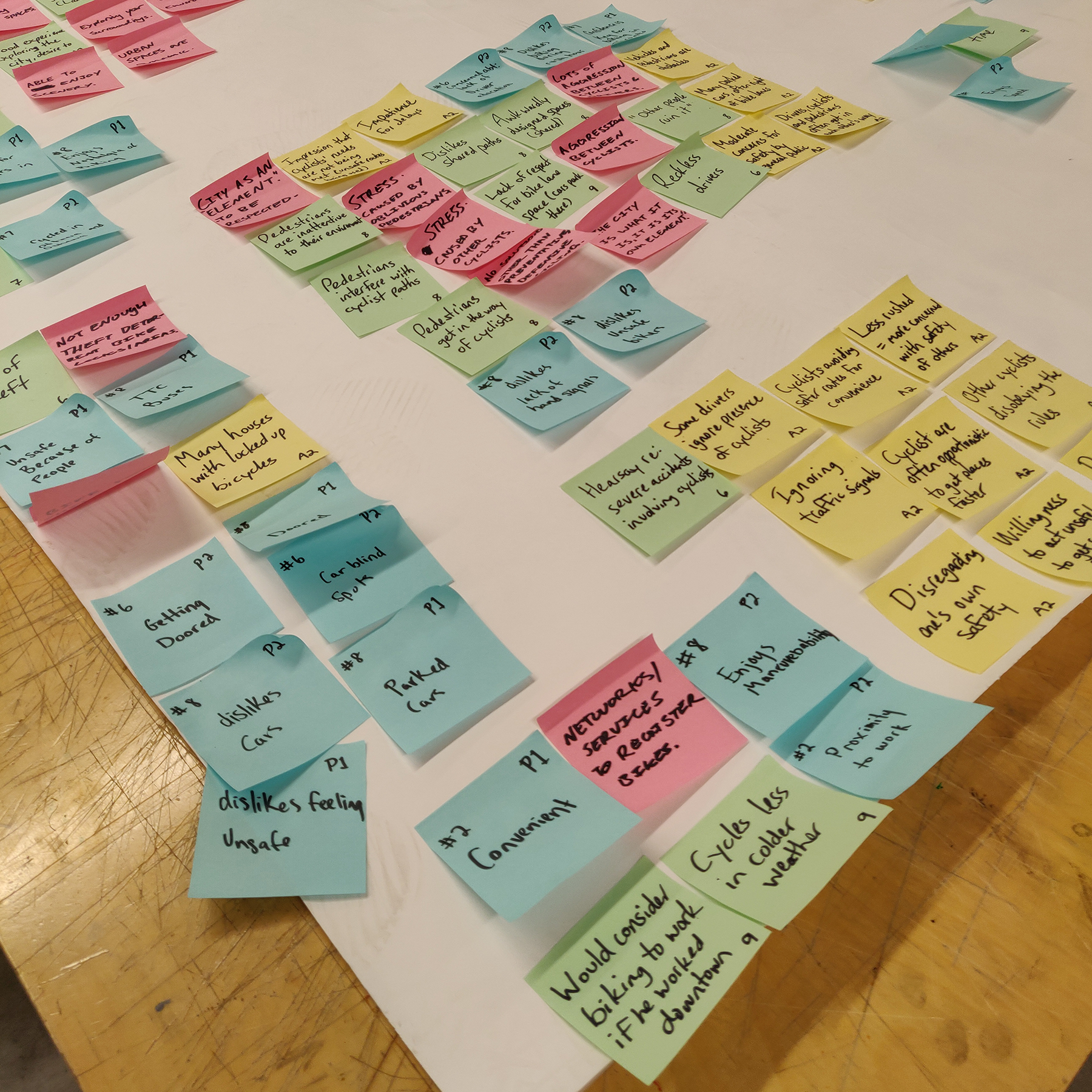
We analyzed and synthesized our data from semi-structured interviews to set the foundations of a potential solution.
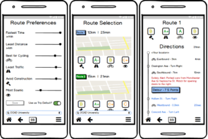
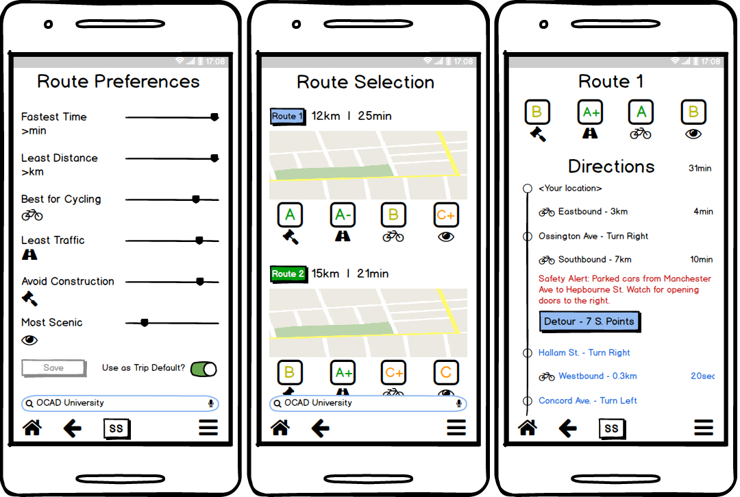
Our criteria led to a low-fidelity app and physical display prototype for cyclists to use while riding, which underwent usability testing with potential users.
Included scalable possibilities (points system for example) to incentivize safe cycling behaviours on top of our core deliverables.
Results
Beyond the scope of the class, this concept is ready for further design and development. Amongst our scalable out-of-scope proposed features were also a data sharing property to connect cyclists with drivers and city infrastructure and social networking features to provide fast, accurate updates to the road conditions, similar to the benefits of the Waze app for drivers. Our data from the semi-structured interviews supports the need for all of these potential directions to take future development in.
Design Process
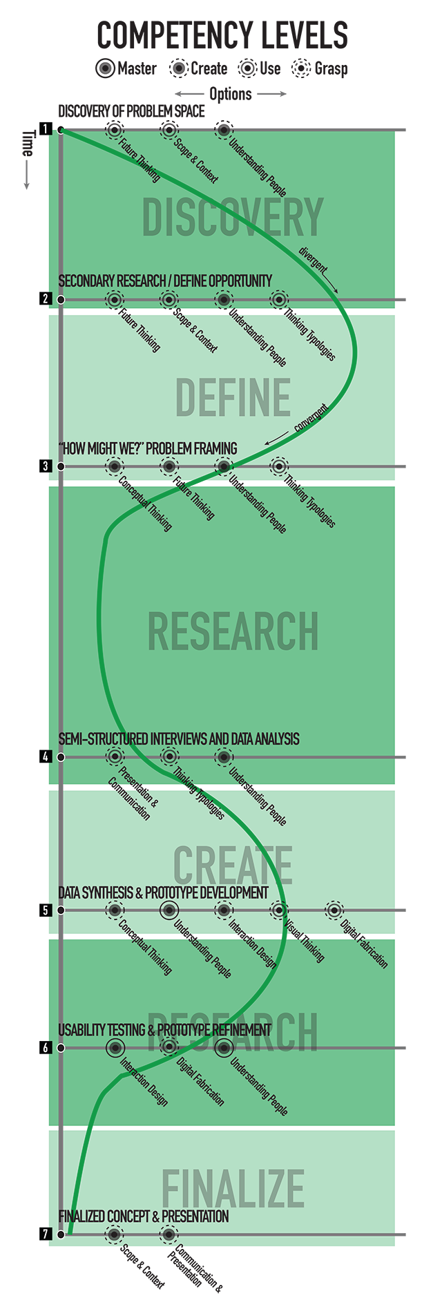
The course lasted for four months, and concentrated on a design research process with a limited scope. We were encouraged to choose a project topic that fell into “Health/Wellness/Fitness”, “Education”, and “Entertainment”, and to design either a space, a product or technology, or a service. The process we needed to follow was a simple “double diamond” approach, in which the first half involved discovering insight into a problem and defining the area of focus, and the second half included development of potential solutions and delivering a prototype at the end.
![]() Discovery of Problem Space
Discovery of Problem Space
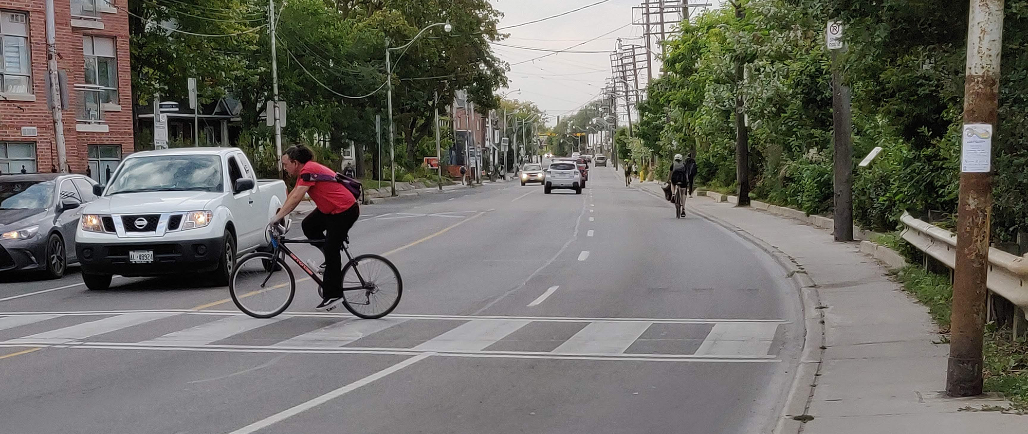
To establish a problem space, my teammates and I opted to draw on personal experience: all three of us were cyclists to some degree. In particular, I am an avid cyclist, and was experiencing Toronto’s cycling infrastructure for the first time, coming from a city I perceived as much more “cycling-friendly” (Vancouver). The idea of how to make a city more “cycling-friendly” was appealing to us.
![]() Secondary Research/Define Opportunity
Secondary Research/Define Opportunity
Part of our problem defining phase involved conducting secondary research, which led me to finding numerous sources (statistics, academic studies, anecdotes) supporting my perception of how dangerous Toronto is for cyclists, and comparisons to the environment of other cities.
![]() “How Might We?” Problem Framing
“How Might We?” Problem Framing
At this point, we moved forward with a “How Might We?” statement that persisted in including ambiguous terms such as “cycling-friendly” and “intimidating” in its attempts to define what problem we are trying to solve and why. I wrote an autoethnography report to include my own observations of Toronto’s problems with cycling, using the AEIOU (activities, environments, interactions, objects, users) observational framework.
![]() Semi-Structured Interviews & Data Analysis
Semi-Structured Interviews & Data Analysis
We chose to target only “new” cyclists (those new to cycling and/or to Toronto), to avoid absorbing biases from cyclists who have adjusted their behaviour to Toronto’s specific challenges. Our interview guide aimed to gain insight into the experiences of people who had not adjusted, to find out how the city does or does not support their behaviour. The resulting interviews generated deep and passionate conversations on the topic, and revealed meaningful themes within the collected data.
![]() Data Synthesis & Prototype Development
Data Synthesis & Prototype Development
The turning point of this project was realizing the need for “genuine” confidence. Several interviewees felt there is a lack of education and understanding of the city’s environment by other new cyclists. This led to an app prototype focused on forewarning users of what to expect and how they can handle cycling in Toronto safely, rather than attempting to “fix” the city in some way.
![]() Usability Testing & Prototype Refinement
Usability Testing & Prototype Refinement
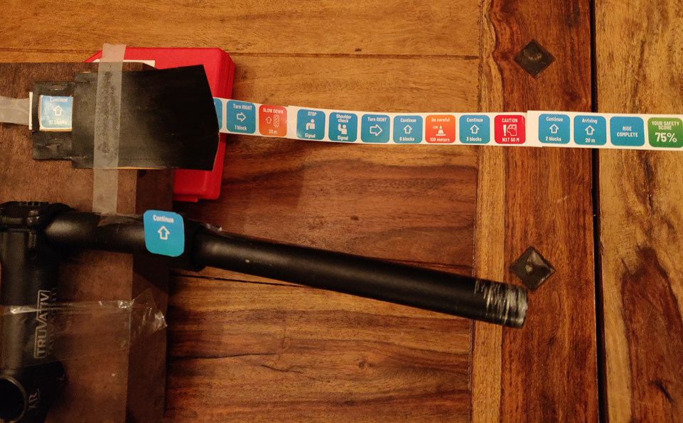
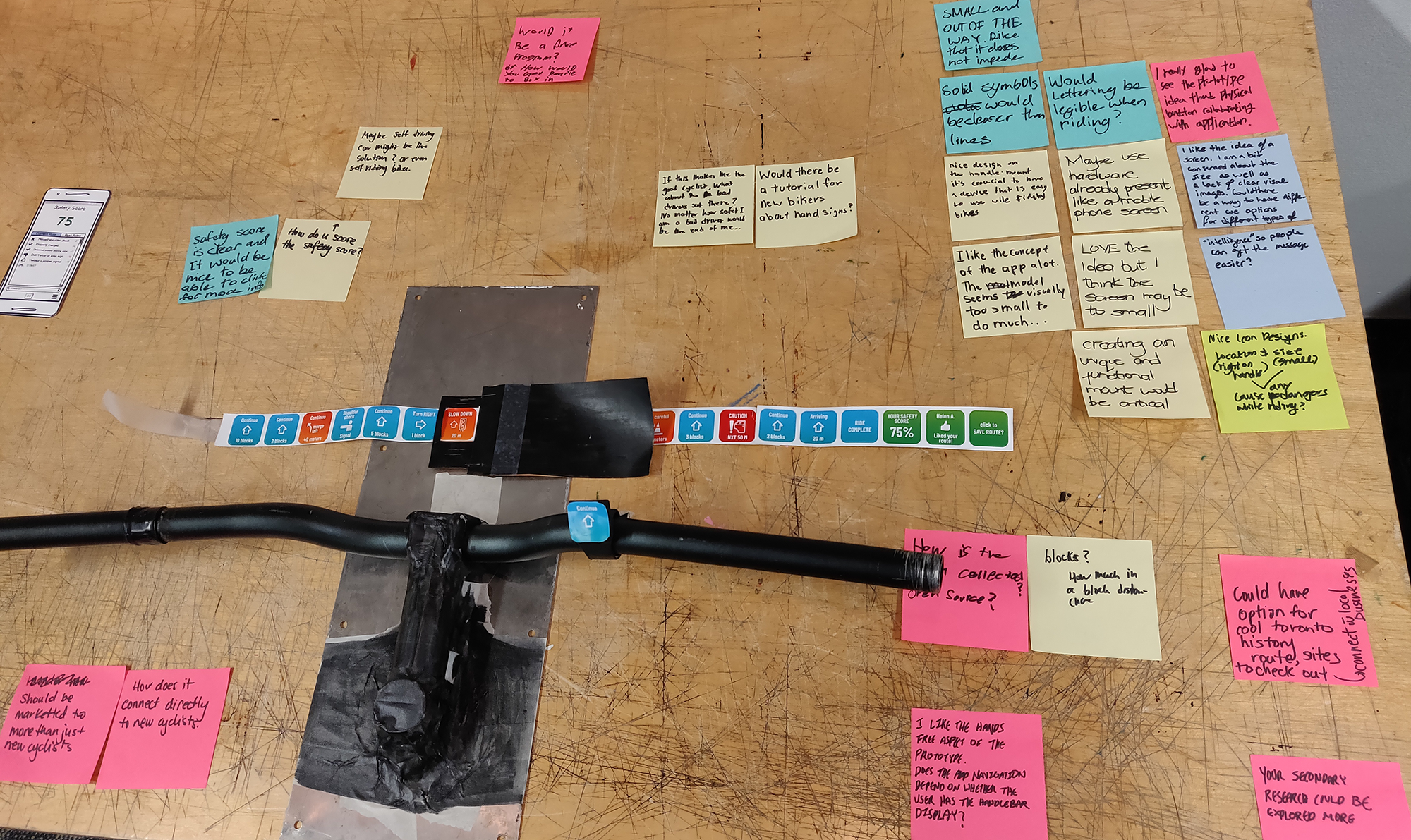
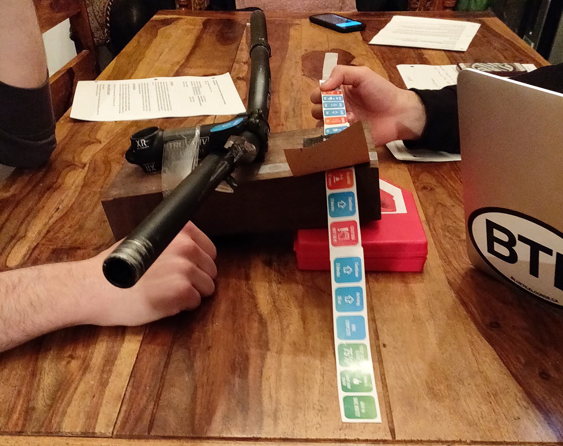
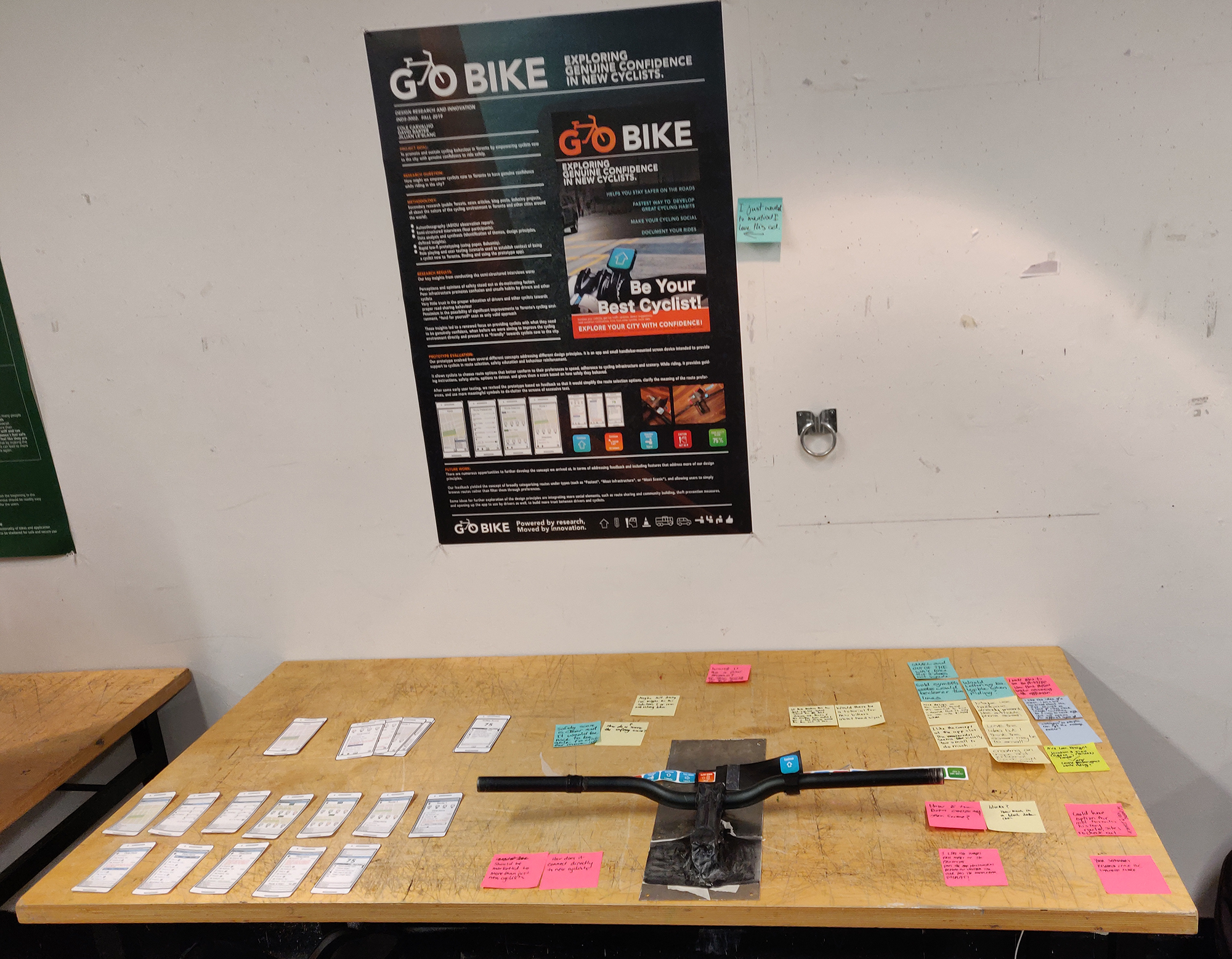
In addition to the app prototype, we built a handlebar-mounted smart watch-sized screen device meant to provide information to the user while cycling, absent the need to keep a hold on a phone. We tested both in iterations, refining after some initial observations in how the app might work more effectively. The final version was very successful, showing how cyclists could have helpful information at hand, and how to react to their, and others’, advantage.
![]() Finalized Concept & Presentation
Finalized Concept & Presentation
The final presentation was a “gallery walk” between booths, ours including a poster and a display of our prototypes. We reacted to several rounds of feedback and shared insights with the class.
- September-December 2020
- Design research, semi-structured interviews, data gathering / synthesis / analysis, Balsamiq Mockups
- Design Research, Interaction Design, Service Design
