Alt Context
Alt Context
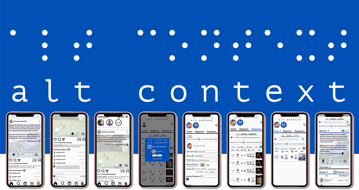
A service on Instagram that provides visually impaired users with self-sufficient access to visual context of media in posts.
Alt Context expands on alt-text by allowing a community of people to contribute their own contextual descriptions of visual media, a bottom-up approach to providing visually impaired users with the resources they need to self-sufficiently improve their digital literacy in a society that increasingly demands it.
Problem Definition
How might we empower visually impaired people to self-sufficiently improve their digital literacy?
How might we bridge the gaps in empathy and mutual understanding between the visually impaired experience with digital media and the visual experience?
Methods
Qualitative primary and secondary desk research (restricted by COVID-19 pandemic)
Speculative design methodologies (Identifying signals, issues & opportunities, future scenario development, contextual speculative artifacts)
User experience journey mapping & micro journey mapping
Empathy mapping & persona development
Physical prototyping (people & spaces where service could be encountered, interacted with)
Digital prototyping using Illustrator, Balsamiq, Adobe XD
Key Insights
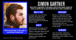
Poor digital literacy is a critical issue for the visually impaired community, results in unemployment, underemployment, financial difficulties, restricted educational options and social isolation.
Visually impaired communities have characteristic resilience and desire to adapt to one’s abilities.
Digital accessibility is provided in a top-down approach by digital content creators, who often do not consistently or effectively provide the resources.
Computer vision technology has significant potential to improve digital access for visually impaired people by automatically generating alt-text and contextual descriptions of visual media, but only if well trained on large quantities of user data.
Visually impaired people who participate in communities online often imitate the behaviour of other users (comments and likes, for example), because they are unable to comprehend the context of visual media but want to be included in some way (this limits their potential engagement).
Visibility of visually impaired users’ needs is paramount to them being actionable (this highlights flaws with alt-text as a resource for accessibility, it is typically not visible enough).
Public familiarity with computer vision is limited, but a service for crowdsourcing contextual descriptions of visual media may provide a template for users to understand some of its possible outcomes.
Solution Development
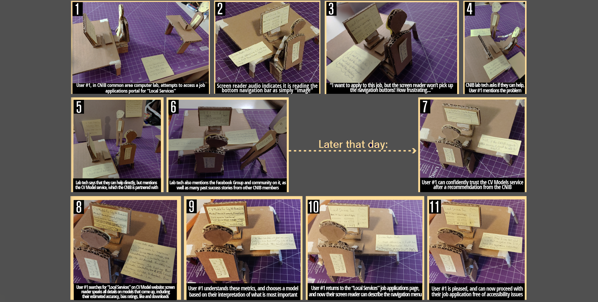
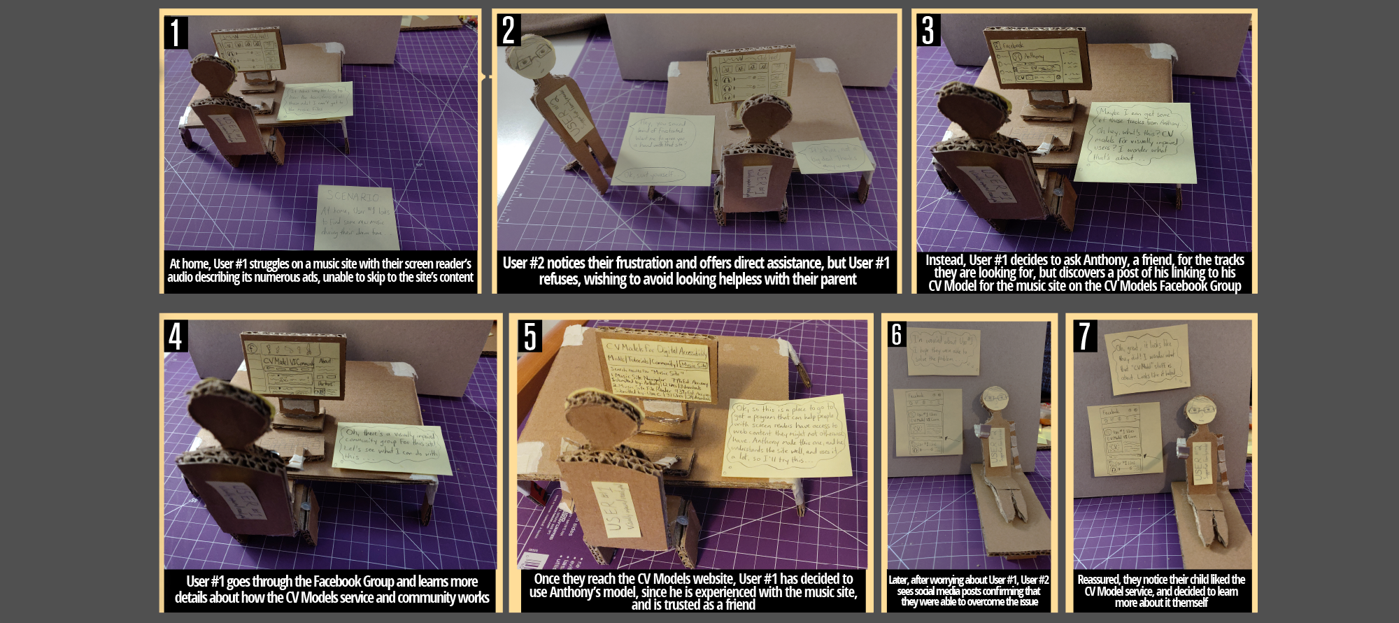
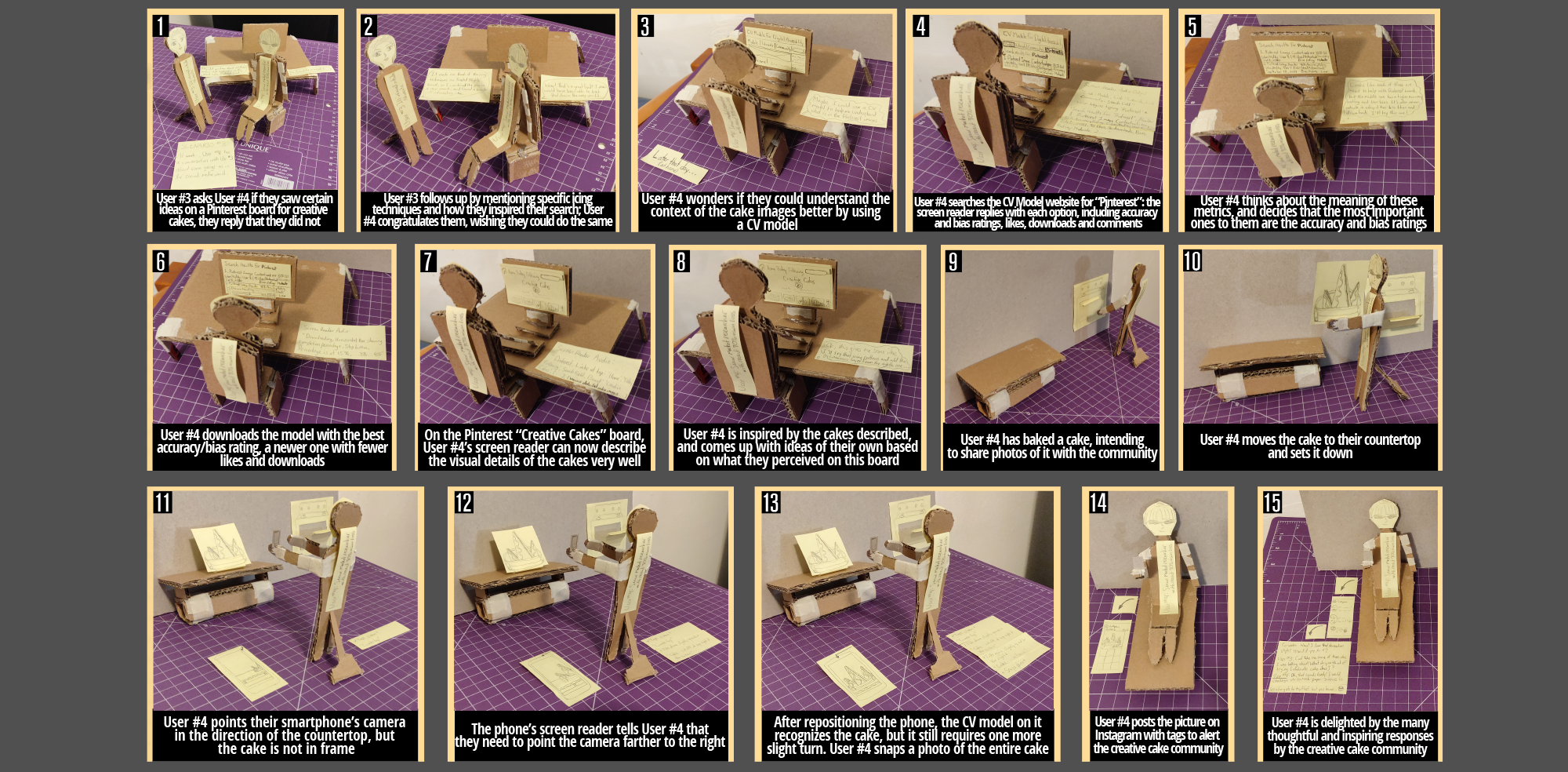
Physical prototyping focused on spaces and methods with which users of specific roles (visually impaired people at home, work, in community space, friends, coworkers and parents of visually impaired people) may encounter a service aimed at helping them improve their digital literacy.
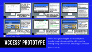
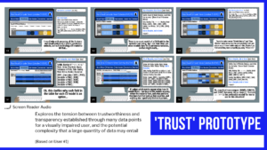
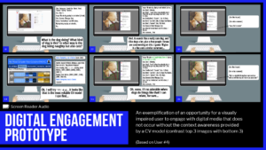
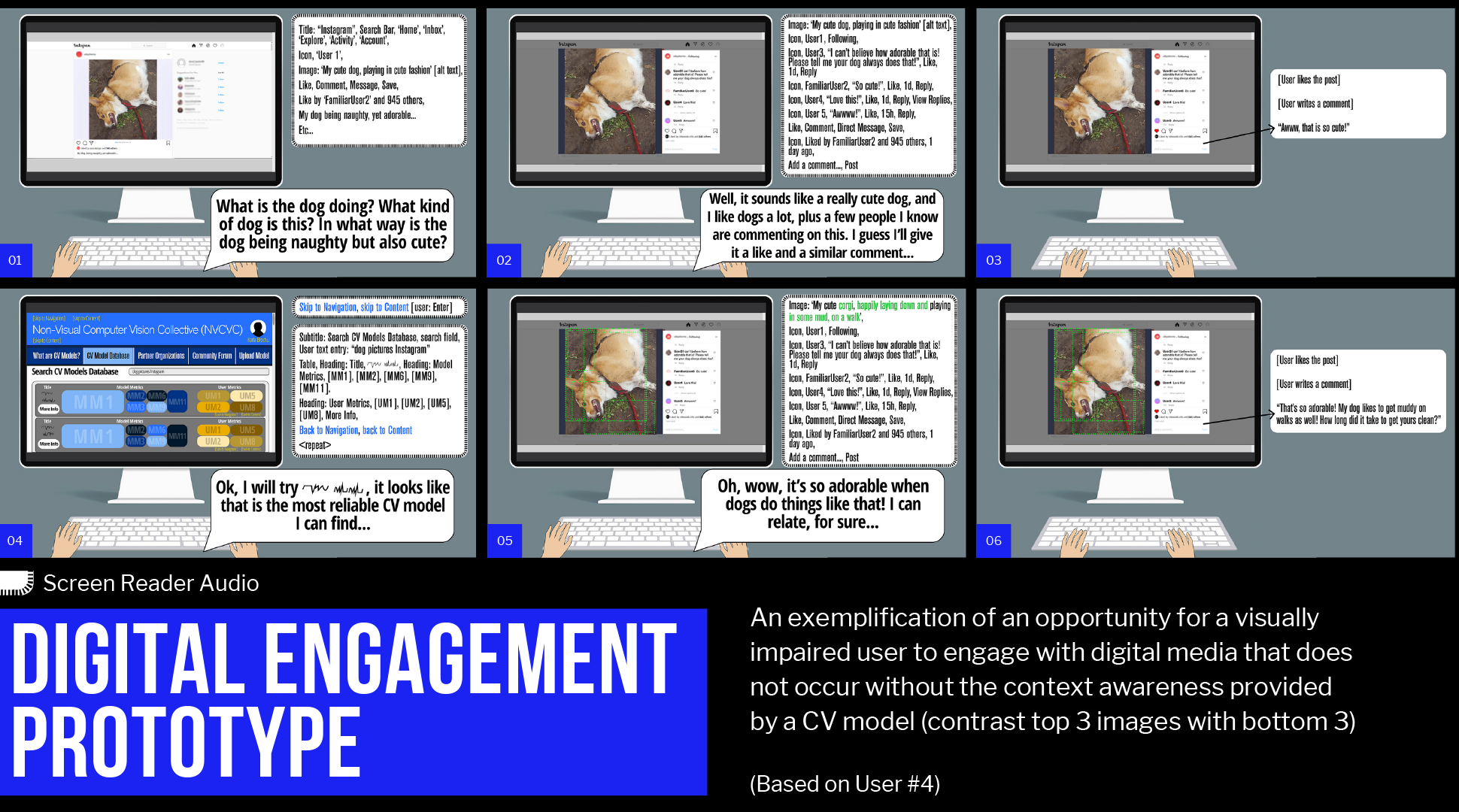
Digital prototypes focused on different use scenarios for a community-led computer vision model repository website (earlier project concept), the change created, and the outcomes.
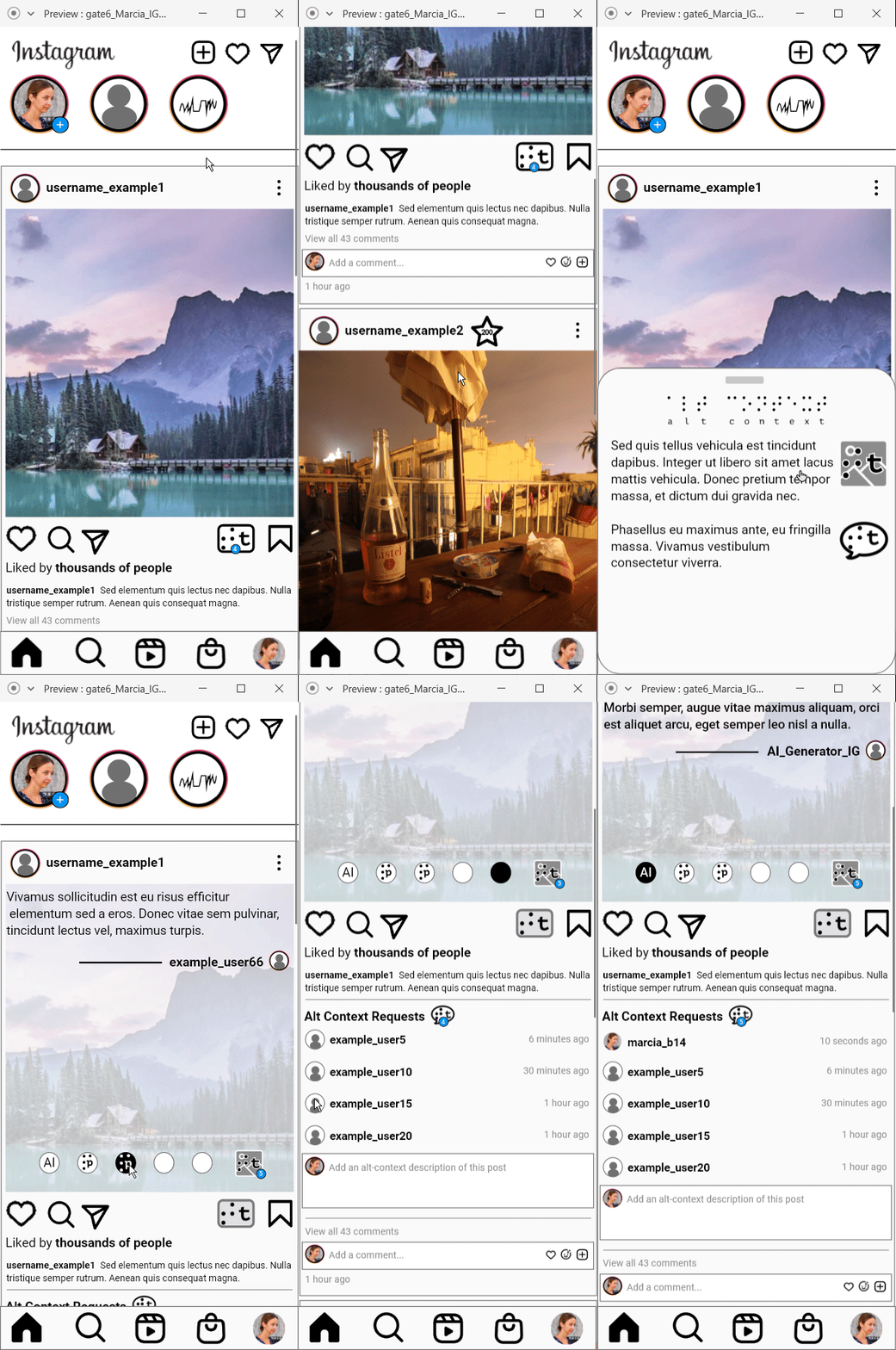
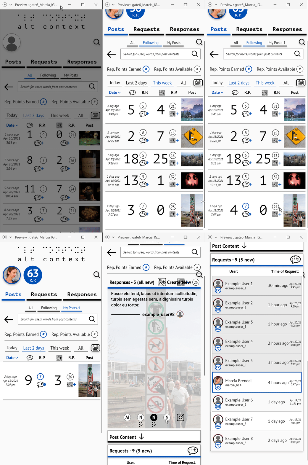
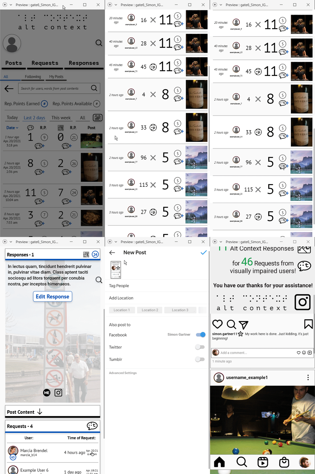
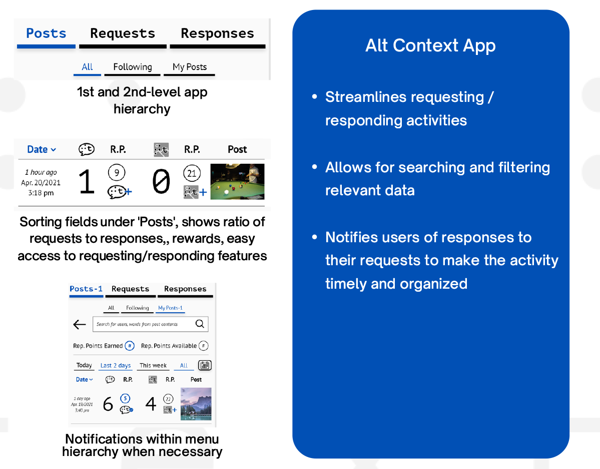
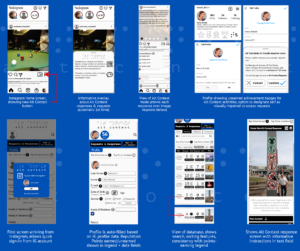 Digital prototypes showing the Alt Context concept integrated with Instagram, providing overlay features to make the need for it clear to users, separate app focused on the activity of requesting descriptions of a post and responding to the request.
Results
Impact
This concept, if fully realized, would significantly improve access to and user experience with Instagram for the visually impaired community, who make up 3.265% of the world’s population, and thus should represent over 30 million Instagram users.
Beyond this immediate scope, Alt Context could be scaled to reach any digital platform with community participation that uses visual media, ensuring visually impaired users can properly access, consume, create, communicate, and share content there.
With the necessary resources to achieve self-sufficient digital literacy in so many communal digital spaces, visually impaired people have the potential to develop more employable skills, participate in more economic activities, enrich their social lives, and establish greater trust and empathy with those who have acute vision.
Recognition
- Runner-up for Edward David Aziz Award for Innovative Excellence
- Featured in OCAD University’s GradEX 106 exhibition, under the “Data Services” category
Design Process
 This was the outcome of my undergraduate thesis project for OCAD University’s Industrial Design program. The course was an eight month long individual major design project, taught by a pair of professors who specialize in critical and speculative design, as well as the role of design in establishing, influencing and changing power dynamics in society. Their expertise was a positive influence in the direction of the project, and ultimately helped establish the outcome of challenging the status quo of accessible tech development and digital accessibility norms. The course was structured into six major milestones, “Gate1” to “Gate 6”:
![]() Gate 0: Identifying Areas of Interest, Signals & Issues
Gate 0: Identifying Areas of Interest, Signals & Issues
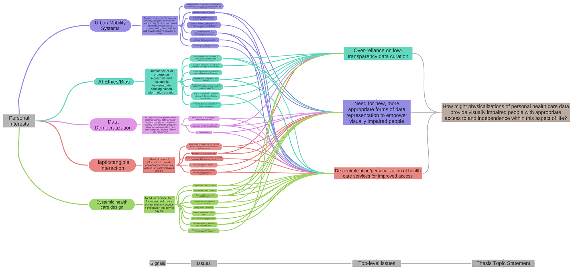
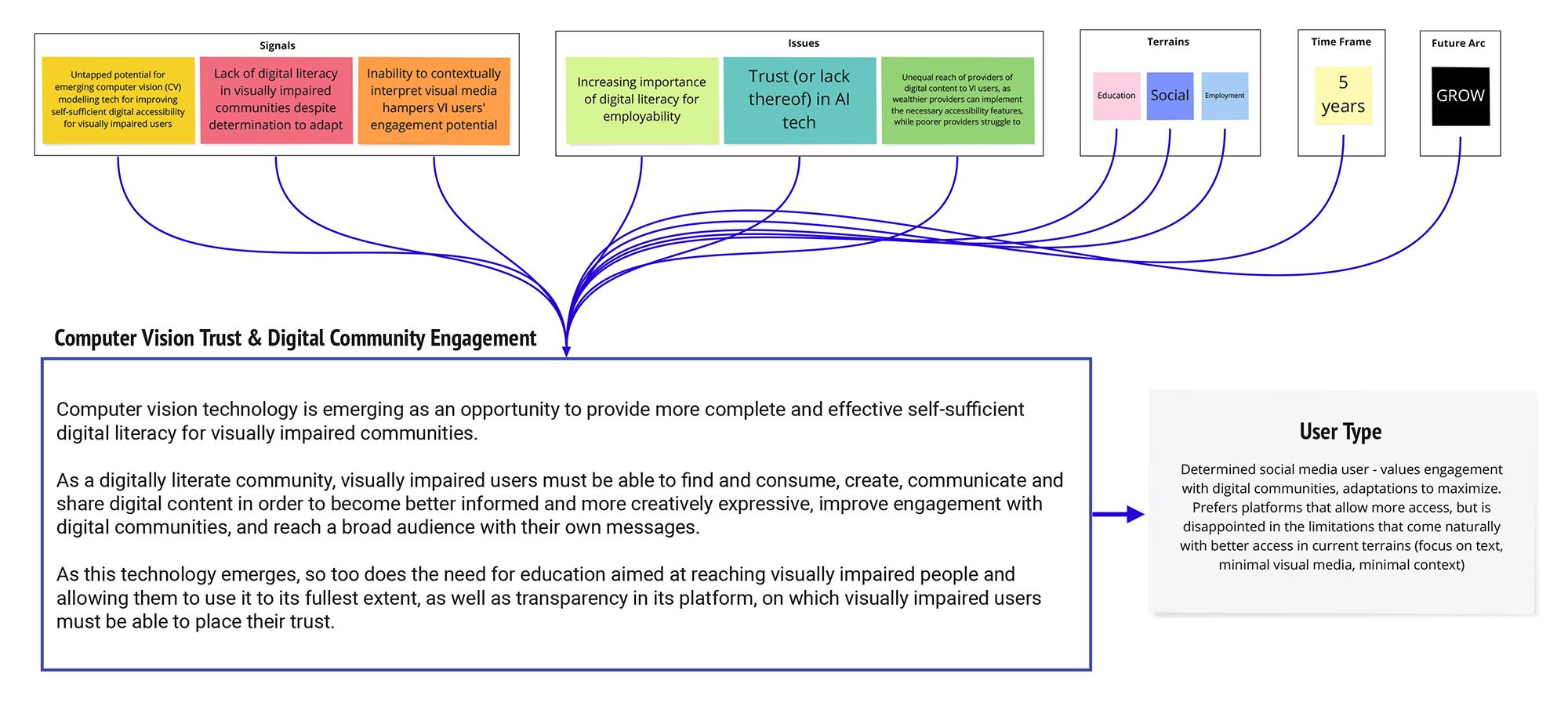
I first identified five areas of interest and did a preliminary STEEP-V scan for trends, signals (indicators of potential trends that have not yet materialized), and major issues that could reveal design opportunities, within these areas of interest. It was also expected that we relate these areas to one another and find hidden opportunities through these relationships.
![]() Defining Design Opportunities & Intention
Defining Design Opportunities & Intention
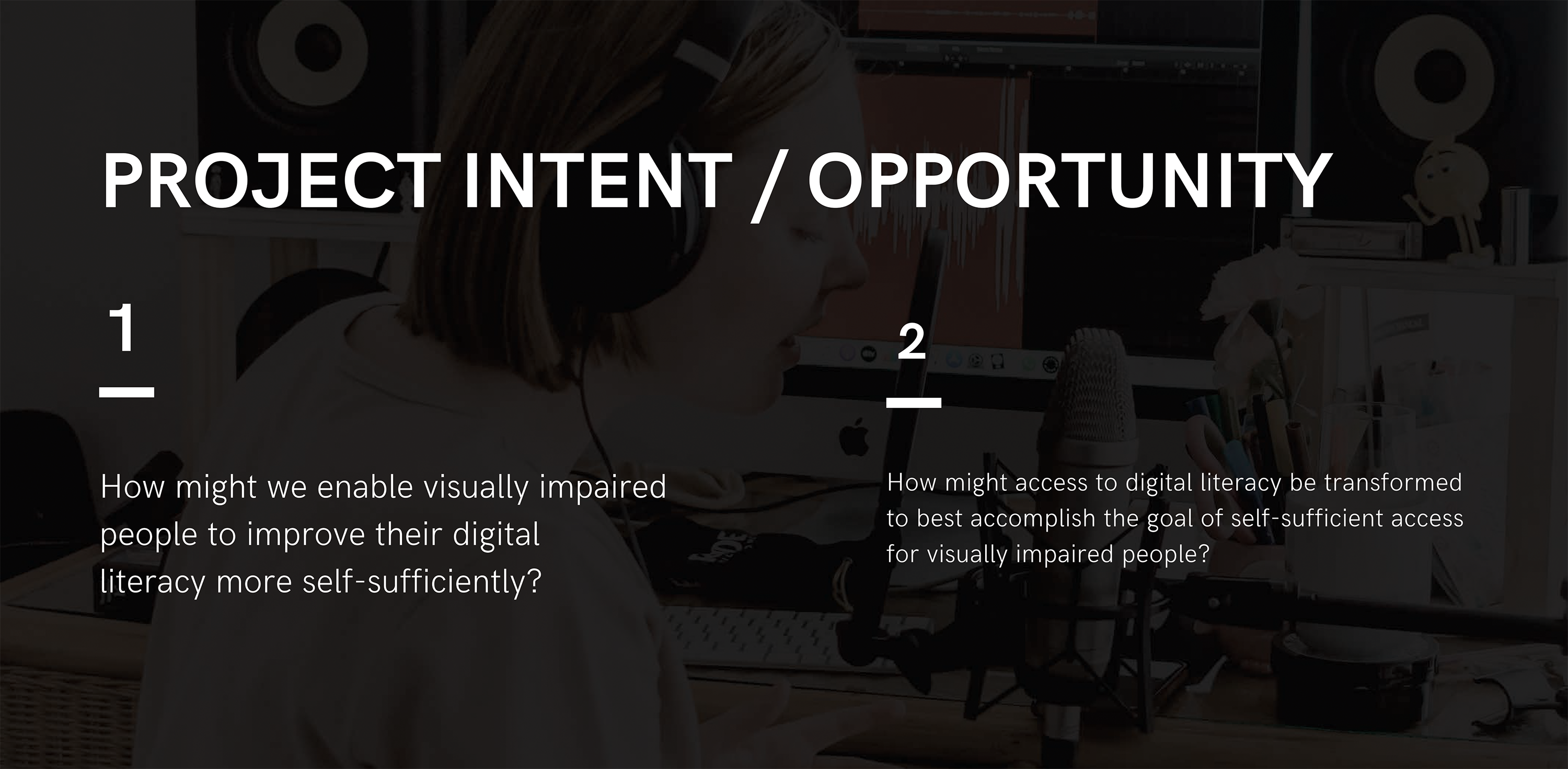
Focusing on research, I discovered several sources touching on the need for digital literacy, what this term means, its importance for people of differing abilities, and how challenges in this area affect many other crucial aspects of life, including employability, financial independence and socialization. For the visually impaired community, the challenges are most often directly related to differing abilities, so I saw an opportunity to change this cyclical issue.
![]() Designer / Maker / User Framework Analysis
Designer / Maker / User Framework Analysis
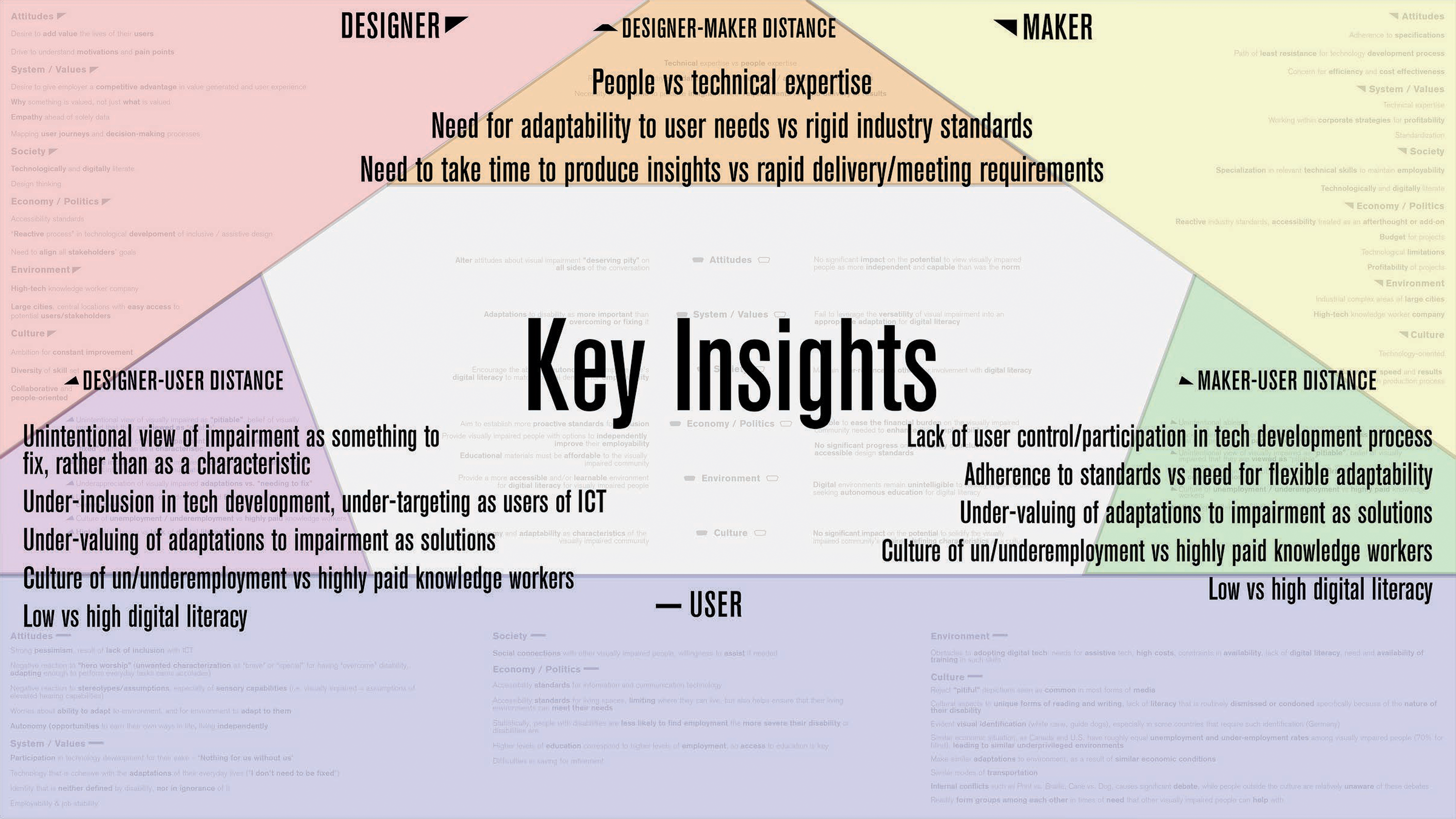
Next phase of research – the key insights here are not only from defining the norms of who is the Designer, Maker and User in my proposal, but what “distance” (differences that cause conflicts/harmful power dynamics) exists between them.
![]() Scenario Development
Scenario Development
Our value proposition was then defined by the term “augmented-physical learning”, suggesting the potential value to be gained by designing a system to deliver physical stimuli remotely and virtually. The major gains we identified were the ability to regain muscle memory (supported by our research) and improve recovery time and effectiveness, the immersiveness of the experiences we could create, and help people spend less time with their lives interrupted by injury recovery.
![]() Empathy Mapping
Empathy Mapping
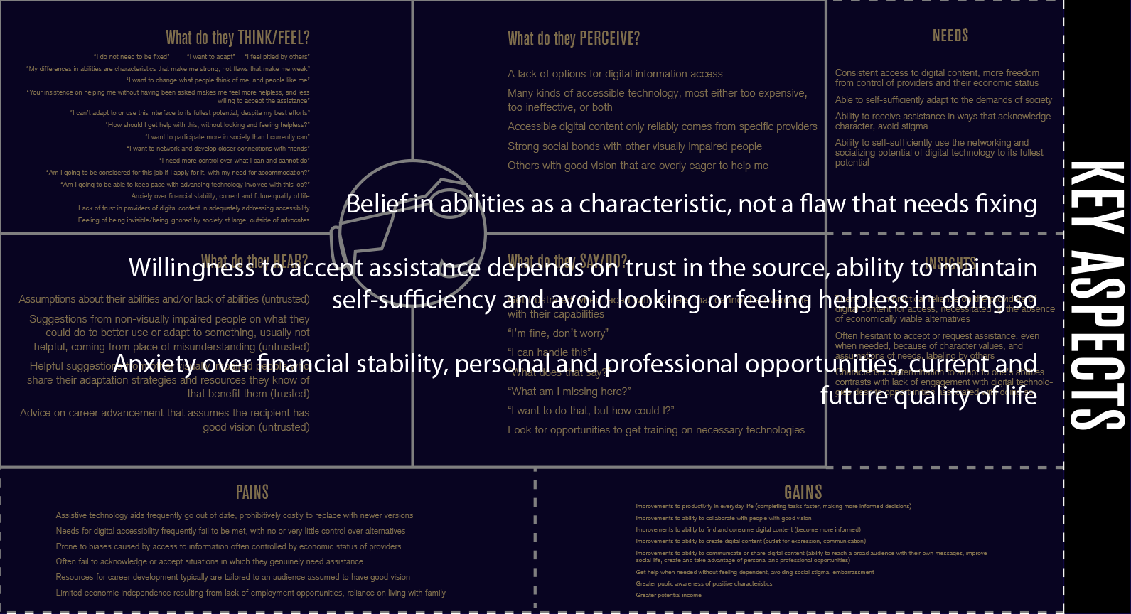
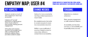
Once this concept began to materialize, the need for education on AI-powered systems and ways to reliably build trust in the technology within this community platform was the main challenge. I worked to develop clear pictures of potential users and roles they could have in this environment, so I developed several empathy maps to explore this potential.
![]() Contextual Speculative Artifact
Contextual Speculative Artifact
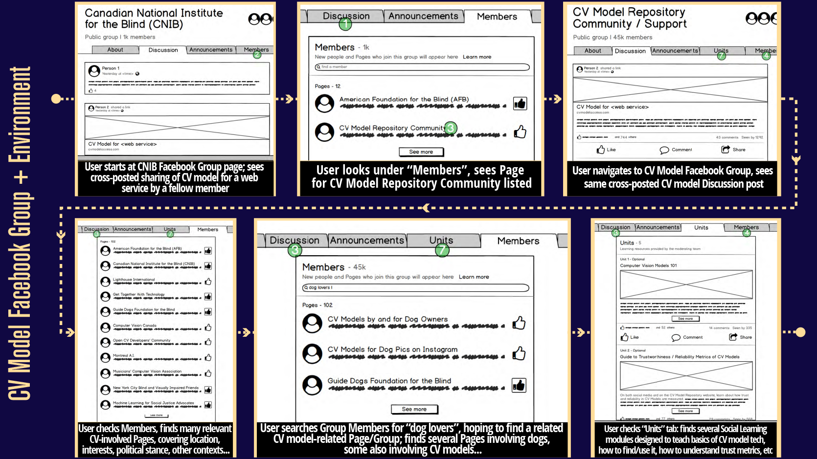
As part of the course’s speculative design methodology, a contextual speculative artifact is a conceptual product, service or system that exists and takes a form as a result of how the main speculative design concept has changed the world it exists in. For my concept, I imagined and wireframed a Facebook Group architecture that unites several communities around the creation of computer vision models, educating the relevant audiences on them, promoting the need to contribute, and pinning down some trust dynamics for the community based on how existing groups on social media promote themselves and establish trust in others.
![]() User Journey Mapping
User Journey Mapping
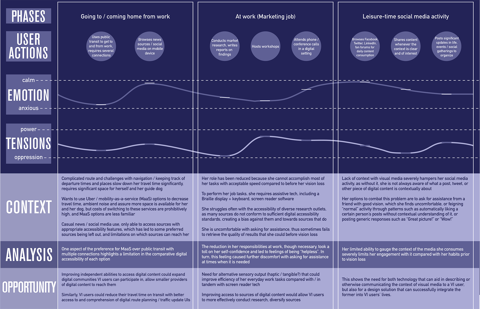
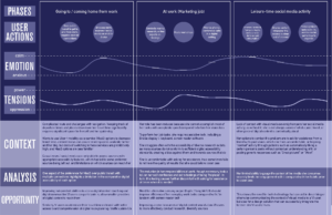
Through fully fleshing out a user journey map and coupling this with further user research, I identified the need among visually impaired users for “context awareness” of visual media; in short, users are unable to understand the full context of images and videos without being able to see them, and this causes behaviours such as aversion of visual-heavy digital platforms, and imitation of others’ behaviours who can see the media, which limits their engagement potential, but is appealing due to the feeling of having participated in social activity.
![]() Defining Design Criteria (Principles, Values & Tensions) & Intended Change
Defining Design Criteria (Principles, Values & Tensions) & Intended Change
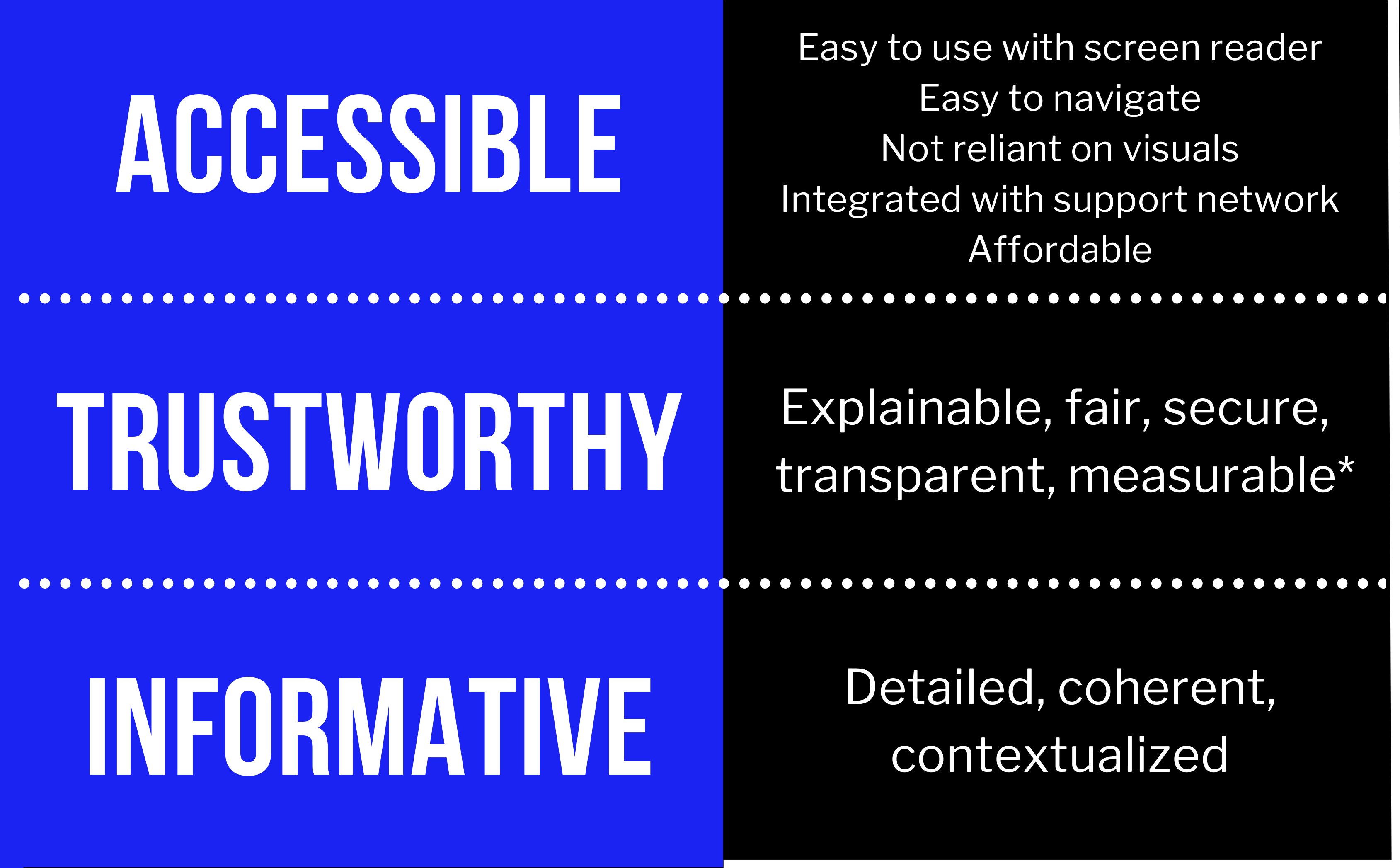
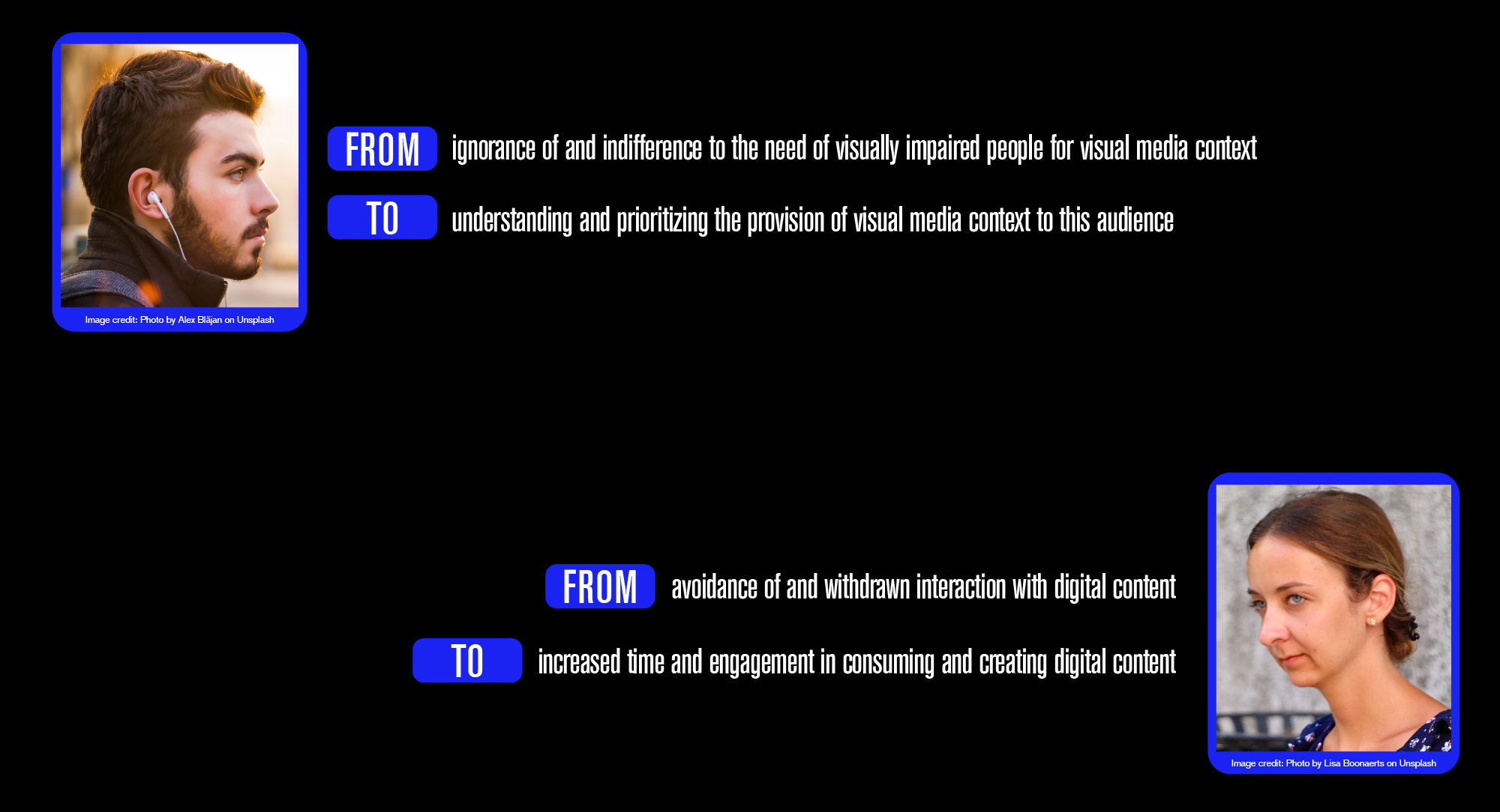
To evaluate and refine our concept, we introduced design criteria in the form of principles (2-3 rules that the project has to follow to achieve its intentions), values (definitions extrapolated from principles, i.e. “Informative” –> “Contextualized”), tensions (opposing qualities that the project could take on, and what level of balance between them would be right for the project to succeed), and intended changes from the project’s impact (”From [x] to [y]”).
![]() Gate 3
Gate 3
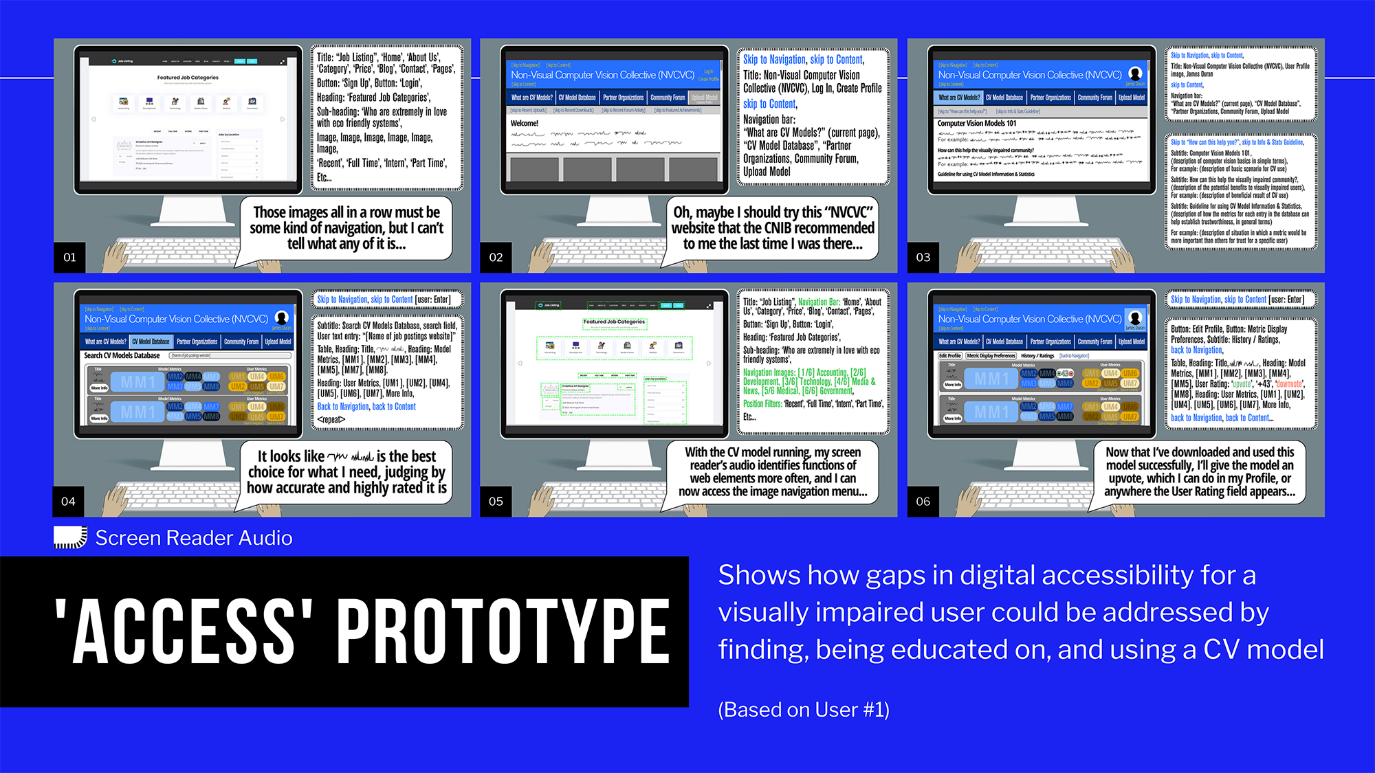
Concluded the first semester of the project with refinements to my design intentions & criteria, empathy mapping, user journeys, and scenarios driven by a contextual speculative artifact. I then entered the realm of digital prototyping, focusing on one key aspect related to my criteria for each prototype I created: an “Access” prototypes, a “Trust” prototype, and a “Digital Engagement” prototype.
![]() Behaviour Shifts
Behaviour Shifts
Behaviour exists at the intersection between a person’s mind and body, but observable to the outside world. Defining how my envisioned users’ behaviours would shift as a result of the existence of my project was a logical next step in evolving its design intention. I went through numerous iterations of defining this shift as changes in actions and opinions for my non-visually impaired user, once they become more informed and empathetic towards visually impaired people, and changes in abilities and engagement potential with technologies and people for my visually impaired user.
![]() Shift to Alt Context concept over CV Models
Shift to Alt Context concept over CV Models
Further prototyping led me to introducing the concept of simply crowdsourcing the CV models’ output in the form of “alt-text” descriptions, as well as trust-driven features such as a “buddy” system for providing this content from one user to another.
![]() Micro User Journey Mapping
Micro User Journey Mapping
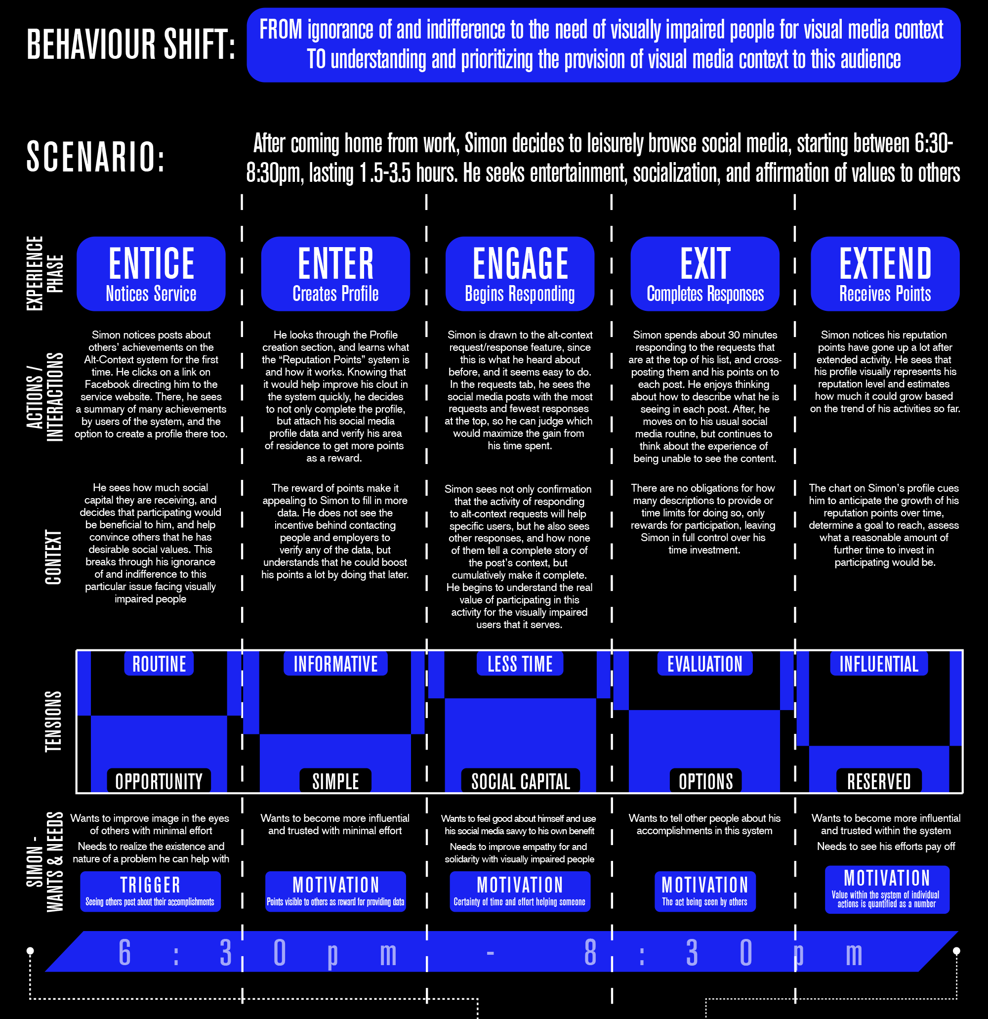
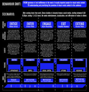
I defined and developed personas based on my empathy maps of “User #3” (ill-informed advocate) and “User #4” (social media power user with recent 90% vision loss), in order to clearly visualize who they are and what they need before developing a micro user journey map that
takes them both through a timeline of activities in which they encounter and use my product. It focuses on the “5 E’s” (Entice, Enter, Engage, Exit, Extend), and since their scenarios are intertwined, I decided to map both journeys on the same timeline, just at different points, which visualizes the minute interactions between them and the product very well.
![]() Gate 4
Gate 4
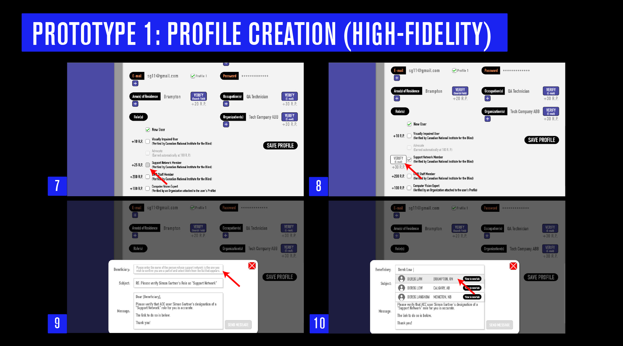
Refined my behaviour shifts, design criteria and micro user journey. The main focus was developing three prototypes of different levels of fidelity. My hi-fidelity prototype demonstrated the profile creation process for the app concept (balance between too much personal data vs. not enough to foster trust between users), while the medium-fidelity prototype was of my envisioned computer vision model requesting component, which was still a part of the project as a scalable option after using the “Alt Context” features of the product, and finally, the low-fidelity prototype was a run through of using the app to filter for Alt-Context requests and responses, manage them, and to participate in the activity of receiving or producing Alt-Context.
![]() System Mapping
System Mapping
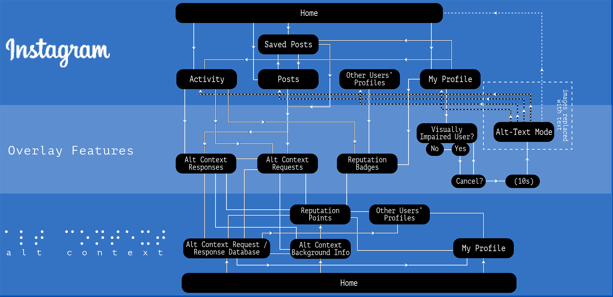
Gate 5 was meant to finalize most of the conceptual elements of the project, its target market, features, interactions, impact, how it functions as a system, and more. I decided to fully de-emphasize the computer vision model platform into a scalable future element that could come into play once users interacting with the Alt Context features (initially on Instagram, but also scalable to other platforms later) and through this learn about what the outcomes of a computer vision model for digital accessibility for visually impaired people would look like down the road. So, when producing a system map, I only included core Instagram features, core features of my Alt Context app, and overlay features on Instagram powered by the Alt Context app that would reach the largest possible audience.
![]() Business Model & Value Proposition
Business Model & Value Proposition
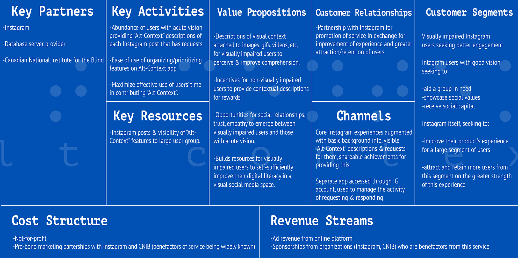
Instagram stands out as an especially visuals-oriented digital platform, so it was the logical choice to focus on. The value proposition for Instagram is thus tied to attracting and retaining a large segment of the population (visually impaired people) that previously could only make use of the platform in a very limited way, while for the users, the resources for self-sufficient digital literacy and social engagement on Instagram would be highly transformative.
![]() Branding Development
Branding Development
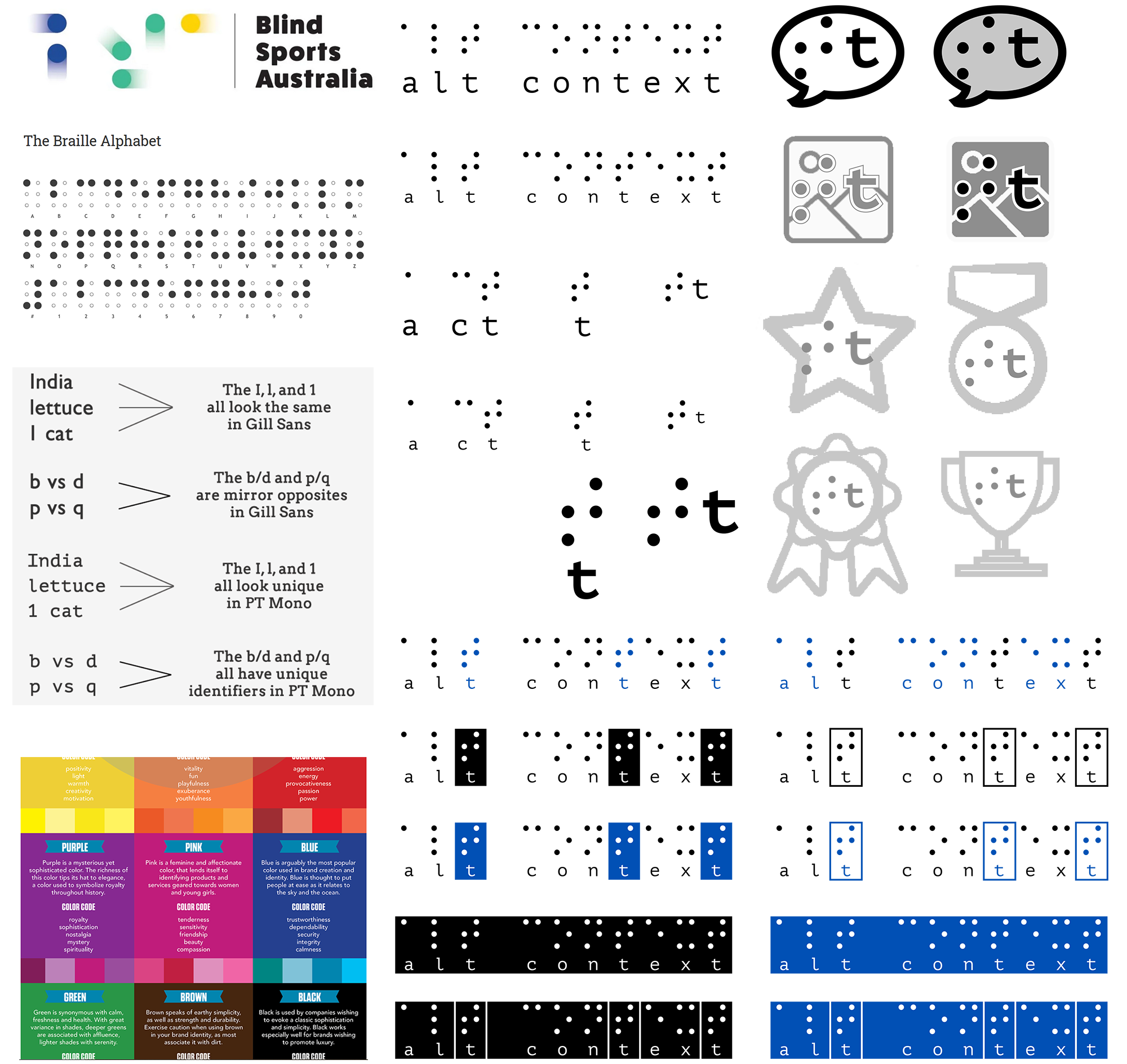
For my brand, I started with the idea of using Braille as a visual element, even though it is meant to be tactile, because its visual form, to people who have vision, clearly indicates “something to do with visually impaired people”, so it helps show who my product is meant to serve. I tried many variations of the words “Alt-Context” represented in Braille and created logos for major features such as requests and responses using simple affordances that indicate their function, such as layering the Braille-t icon over an image icon for responses (which appear as overlays on top of the images).
![]() Gate 5
Gate 5
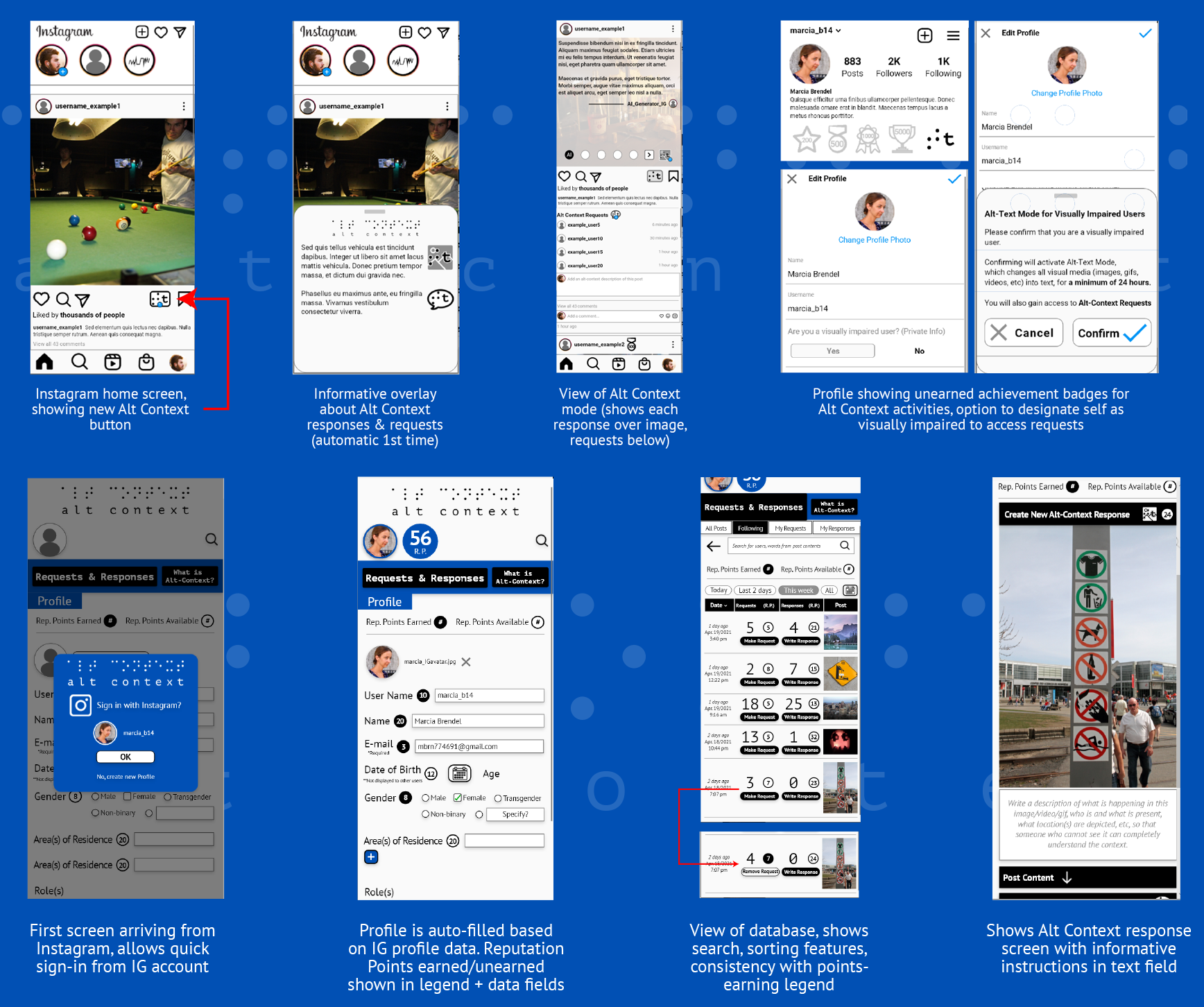
The final prototypes I delivered for Gate 5 used some of the visual elements of those from Gate 4, but having developed a brand identity for an app, the style changed substantially towards that end. I focused on demonstrating the new features on Instagram, how it connects to the app, why and how the app should be used, and what it looks like from my two users’ perspectives. I also developed a short scenario movie that focused on who the users are, and what impact using the app would have for each of them.
![]() Gate 6
Gate 6
My final deliverables for Gate 6 were all about refining the project as much as possible. Mainly, I updated the branding and how it was being used in the prototypes to conform the look of the project more to Instagram’s visual aesthetic, while still standing out as its own brand. I did this by making the menus and headings, as well as the icons, much less heavy, and much simpler. It was still a challenge to sufficiently minimize the information design of the app screens – this remains a work in progress.
Finally, my scenario movie for this final deliverable was updated to better communicate the behaviour shifts more so than only the impact that using the product would have on its users. The audience needed to see some degree of what using Instagram (for visually impaired users) and being unfamiliar with the visually impaired community’s needs (for non-visually impaired users) looked like without Alt Context, as well as how Alt Context could change that.
Individual Project
- User research
- Concept development
- Physical & digital prototyping
- Content strategy
- Brand guideline development
- September 2020-April 2021
- Adobe XD, Illustrator, Photoshop
- Design Research, Inclusive Design, Interaction Design, Service Design
