Point Locus
Point Locus
A wearable, tactile GPS garment that allows visually impaired people to travel independently.
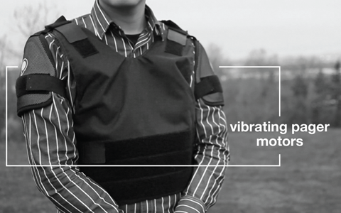
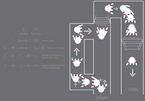
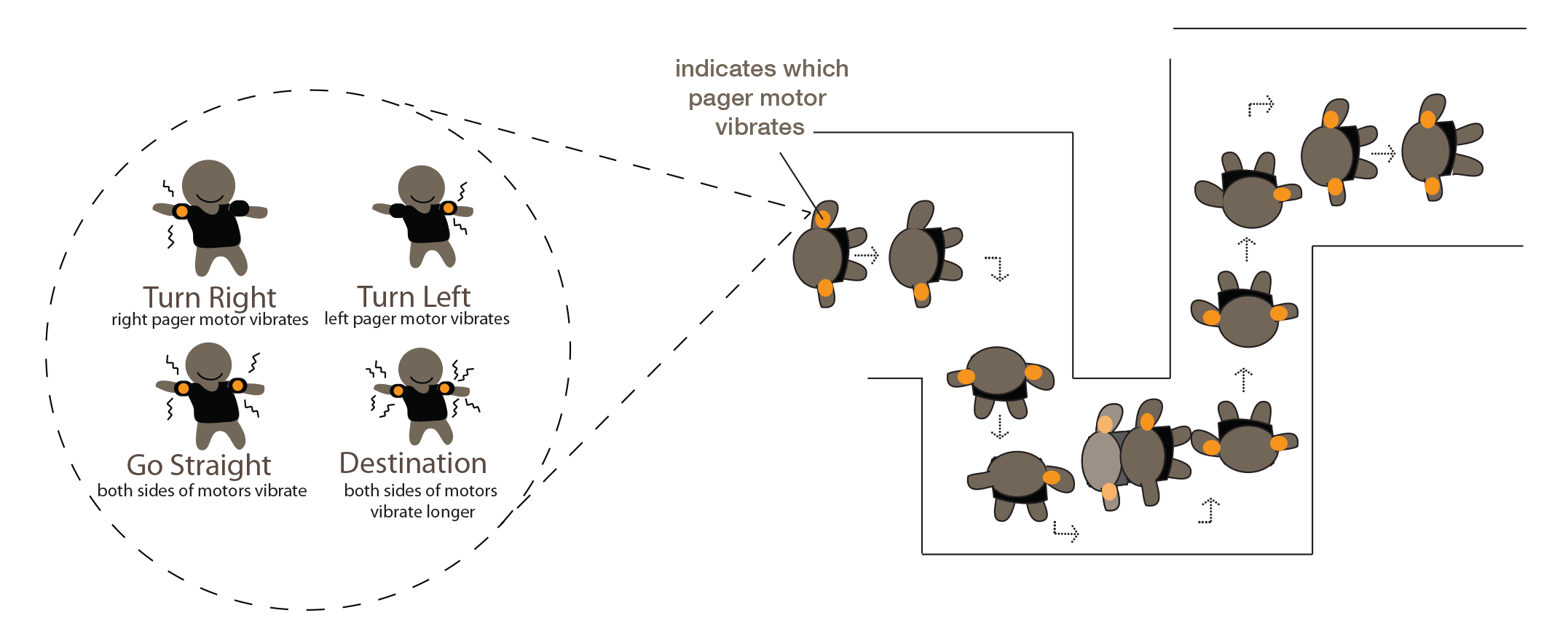
“Point Locus” uses tactile sensations on the user’s triceps to communicate directions from a GPS. Its language is a simple series of vibrations: left tricep for “left turn”, right tricep for “right turn”, both triceps at once for “forward”, and a longer vibration from both sides for “arrived”. It acts like a car GPS, warning slightly in advance of upcoming turns, and giving the “forward” signal at an interval to verify one’s course, keep the user attuned to the vibrations, and make sure they know the device is working.
Problem Definition
How might we empower visually impaired people to become fully independent travellers in consideration of their abilities and existing adaptations?
How might haptic sensations on the body be used for communication and / or language development in a non-visual sensory channel?
Methods
Primary and secondary qualitative research
User interviews and usability testing
Physical material and electronics prototyping
Observational research
Rapid concept development & evaluation
Key Insights
It is way finding, and not navigation, that holds visually impaired people back from independent travel.
Audio feedback for a GPS device is inconvenient to visually impaired users, and to others, because noise interferes with the communication of directions.
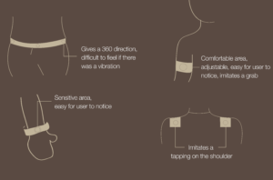
Triceps being rooted to the left and right side of the body and separate enough to feel distinct sensations, make them the ideal area for vibrotactile feedback.
The solution must be affordable, as visually impaired people often suffer from low income (key reason for failure of Trekker Breeze).
Solution Development
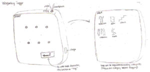
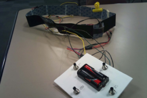
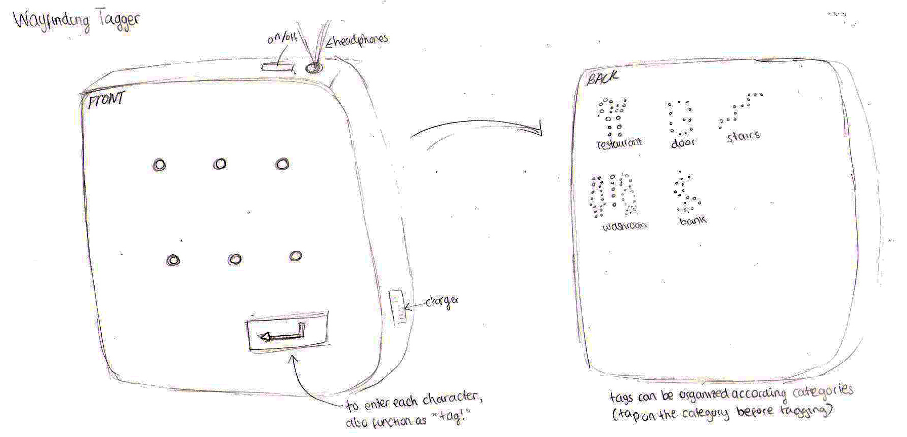
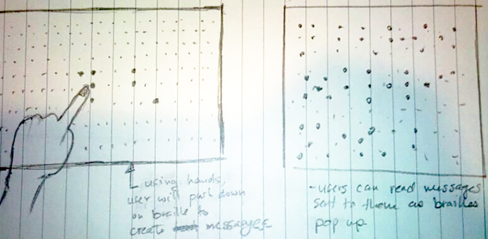
Early concept sketches showing my team’s thinking process – we went from “digital Braille” to navigation aids (glove mounted range finder with audio feedback), to a vibrating way finding prototype manually operated with a controller that was worn around the waist and had four pager motors and more complex vibration signals.
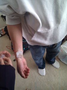
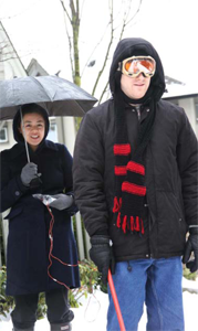
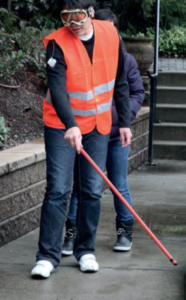
Due to delays in recruiting visually impaired participants for usability studies, we decided to orient ourselves with the user experience we were designing by wearing our prototypes ourselves, and testing different language options and positions on the body for the pager motors.
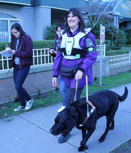
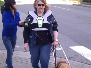
After refining from the previous sessions, we held a large usability testing session with recruited members of the Canadian National Institute for the Blind, and validated our tricep-mounted prototype and language with their input.
Results
Point Locus from Stephanie Wiriahardja on Vimeo.
The research and evaluation of our concept has proven that this idea has the potential for widespread acceptance and use. Participants learned how to interpret the feedback and use it to navigate unfamiliar streets in moments, indicating a very low learning curve, and response to the conceptual device was, on the whole, overwhelmingly positive. I am intending to further pursue the full technological realization of the concept in the future, once I have the opportunity to do so.
Maker Faire 2011 (San Francisco & Vancouver)
Our social media posts near the end of the course caught the attention of Lynne Bruning of the eTextiles Lounge, who invited us to present our project at the 2011 Bay Area Maker Faire, since the project fell into her interest in wearable technology.
During Maker Faire, we set up a booth and pitched the project to several hundred passing attendees, and also participated in an eTextiles fashion show. Near the end of the weekend, we also did a live interview with Mair Dundon and Alexa Smith of the Artfuture blog. We found that our project struck a chord with almost everyone we talked to – once we described the “vibration on the triceps” concept, almost everyone immediately understood, and their eyes lit up with interest. With Lynne’s help, we also managed to get ourselves a booth at the 2011 Vancouver Maker Faire, and went through a similar experience in our home city.
Design Process
This project was designed in an undergraduate capstone course at Simon Fraser University: it was the result of an eight month long design process conducted in a team of five Interactive Arts and Technology students, in which I took on the roles of team leader, design research lead, content writing lead, and prototype building. Below, I have outlined the full design process, and the numerous design competencies I developed over the course of the project:
![]() Initial Concepts
Initial Concepts
To establish a concept direction, the focus was on sketching ideas. Many of our earliest ideas were solutions for visually impaired users, as I expressed an interest in inclusive design for such an audience.
![]() Problem Definition
Problem Definition
We made a conclusive choice to design for a visually impaired audience, and conducted interviews to establish a problem. We found consistently that our interviewees were concerned with becoming more independent in everyday life.
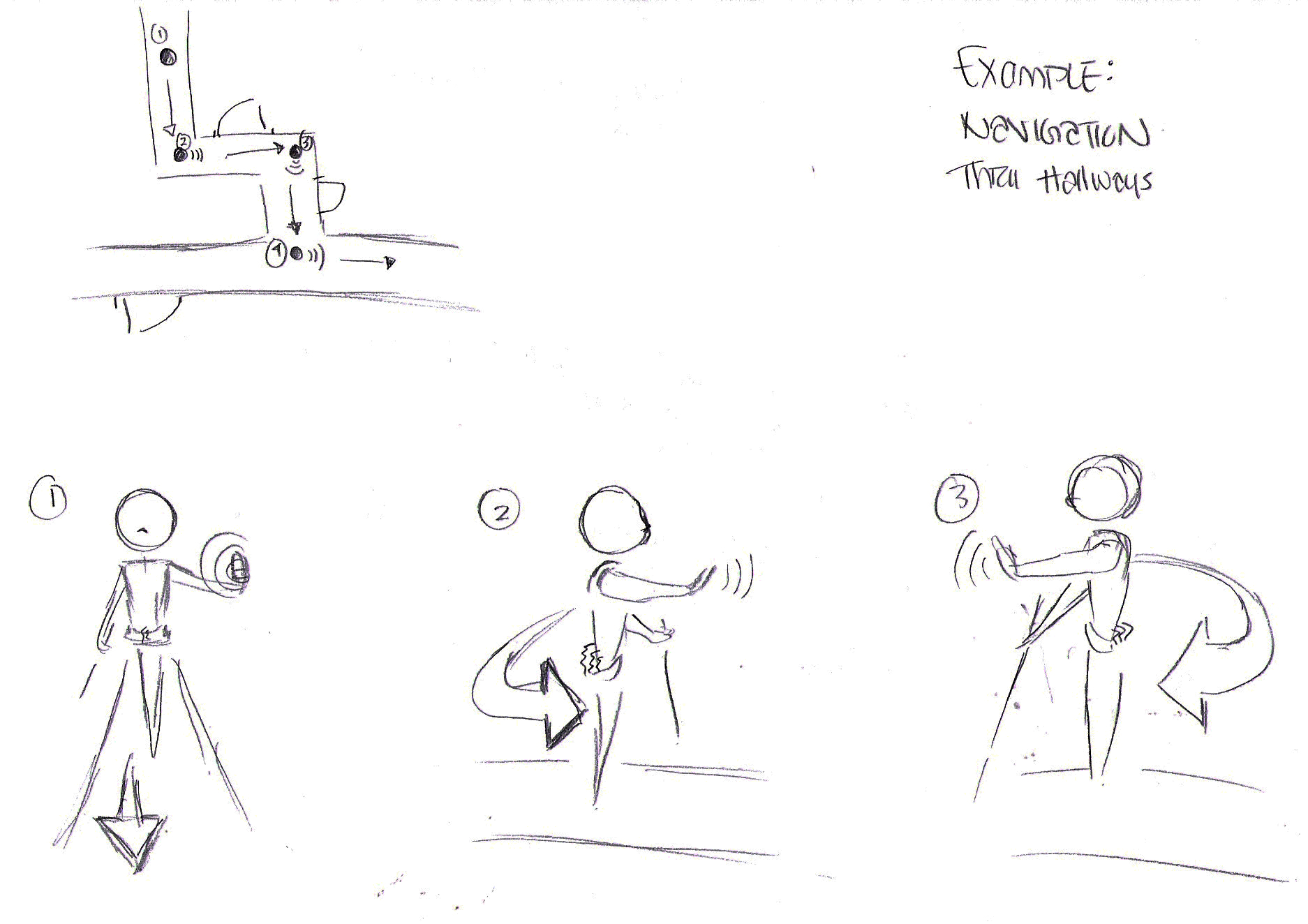
Our research led to the goal of helping visually impaired people be able to travel independently, in accordance with insight from interviews. To make use of non-visual senses, we developed an auditory navigation tool and a tactile way finding tool and gave them each a few different form options.

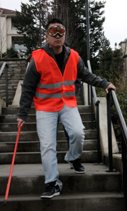
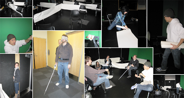
We prototyped both a cane-mounted and glove- mounted ultrasonic rangefinder that produced faster tones depending on proximity, and a manually controlled vibrating belt for directions. We set up a paper maze mounted on chairs and had both visually impaired and sighted, blindfolded users navigate it using both prototypes. We found that the visually impaired users neglected the rangefinder and used their canes and/or guide dogs normally.

We concluded from the user tests that a navigation aid was not necessary, due to existing adaptations, but that a way finding aid had strong potential. The tests also showed that a belt may not be the ideal form, as frequent vibrations so close together on the body resulted in less sensitivity to each signal over time. We began to explore other forms, such as wrist, shoulder and tricep-mounted vibrating actuators.
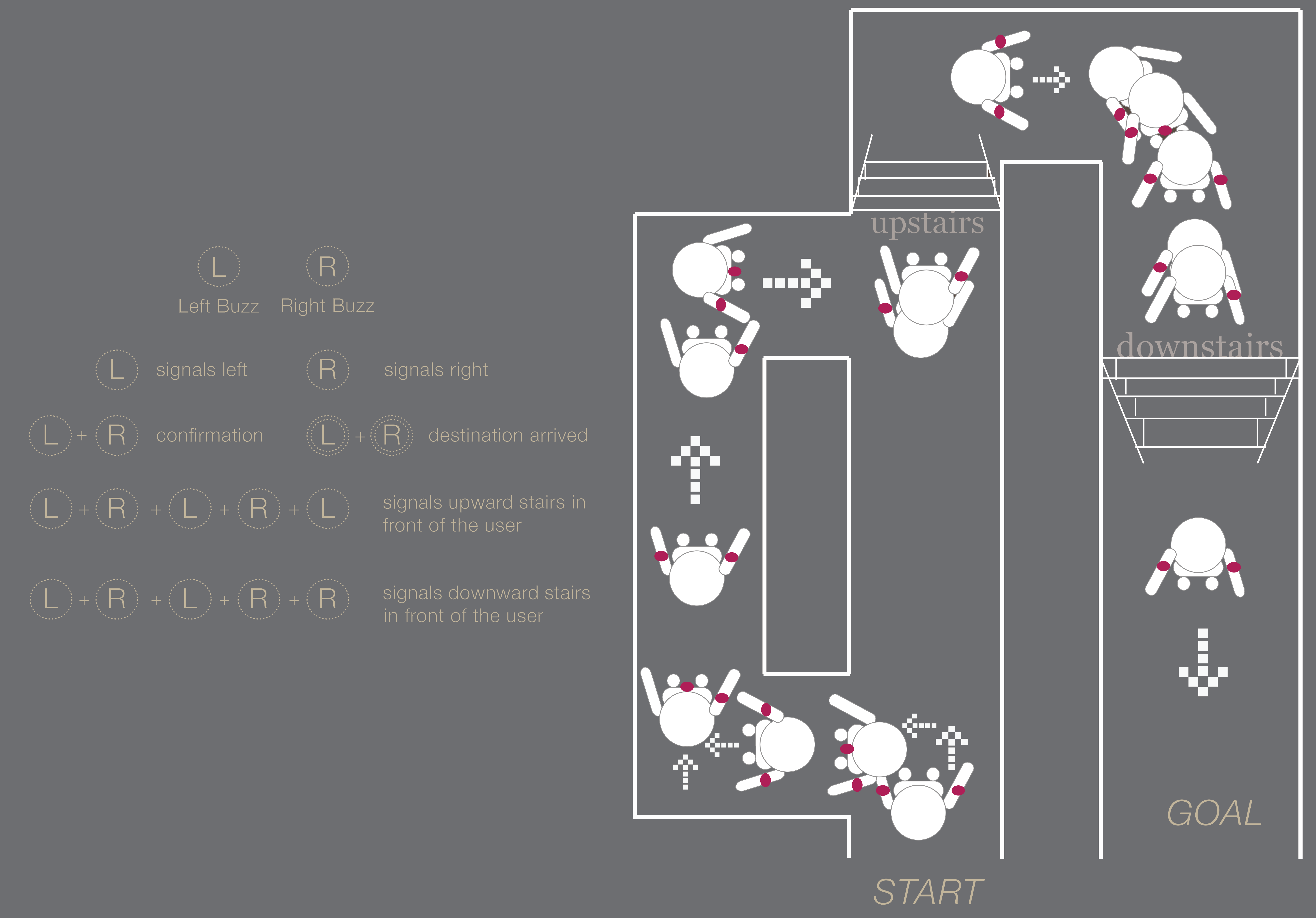
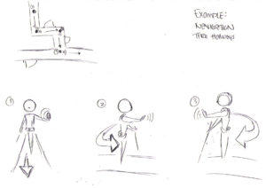
Continuing to develop our form and language of vibrations, we removed our “forwards” and “backwards” signals, and moved to a “stop and rotate” interaction to allow only two actuators to express precise directions to turn in (or reverse). We used ourselves, blindfolded, for user testing in order to quickly validate our new language and form factors and reach a decision on how best to move forward.
![]() User Test 3 + Confirmation of Insight
User Test 3 + Confirmation of Insight
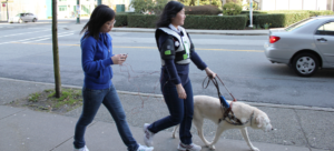
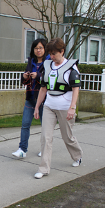
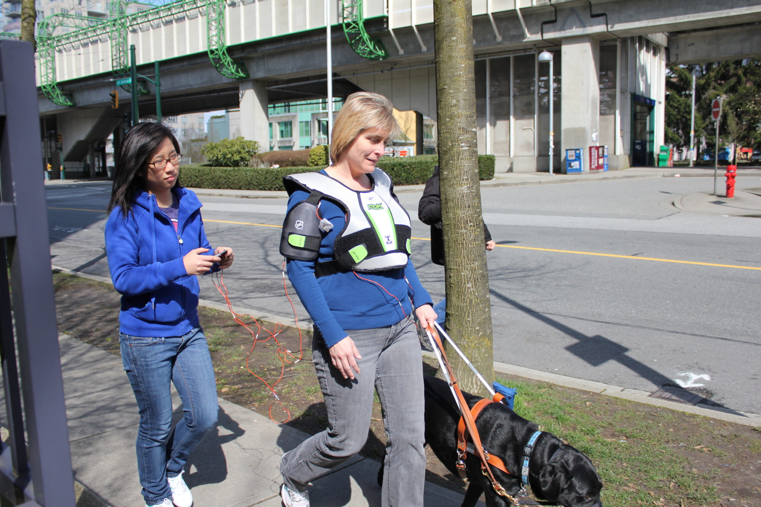
After deciding on using the tricep-mounted actuators as our form, we built a prototype using a hockey chest guard, and developed the language once more, to operate like a car GPS, giving directions just in advance of a turn. This proved more effective when we conducted a user test with five visually impaired users, who were easily able to follow the directions and instruct their guide dogs where to go.
![]() Finalization + Presentation
Finalization + Presentation
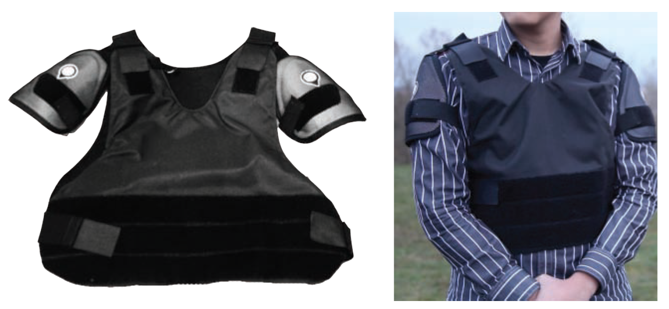
To wrap up the in-class portion of the project, we crafted a presentation that visually communication our intended interaction design, technical specifications for the final prototype, user study results and next steps. We were not able to make a fully functional GPS-enabled garment (only manually-controlled), so we speculated on how to realize it.
Group Project
Teammates
- Emily Chen
- Kennett Kwok
- Karen Truong
- Stephanie Wiriahardja
My Responsibilities:
- Usability testing planner
- Lead user researcher
- Observation analysis & insight discovery
- Physical prototyping (electronics, wearable tech)
- Lead concept development
- Report & script writing
- September 2010-April 2011
- Arduino
- Haptic / Tangible, Inclusive Design, Interaction Design
